Nike Shinjuku Identity
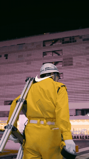
Shuetsu Sato has dedicated his career to Shinjuku Station. For over twenty years, alongside his duties as a security guard, he has crafted directional signage from duct tape. This is functional art that millions have followed without ever looking twice. This project was the first time the “world” stopped and looked.
Role: Creative Director / Design & Art Direction
Link to Social Post
-
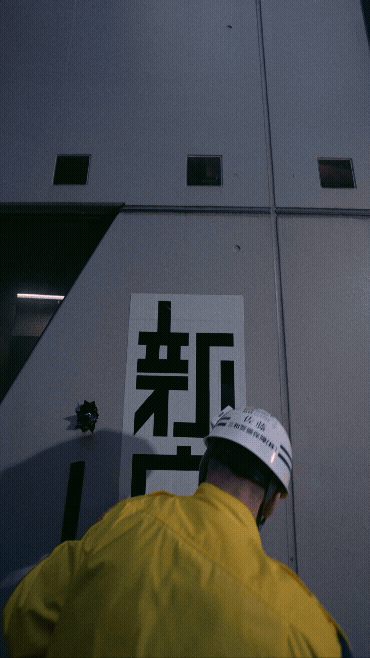
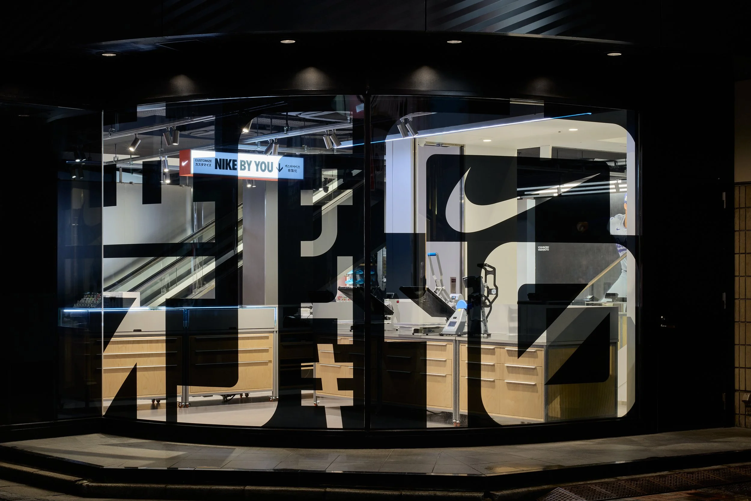
Shinjuku is a landscape of sensory overload where four million people move daily, but few truly arrive. Opening a Nike flagship here meant competing with the world’s most intense visual environment. We needed an identity that could cut through the noise without diluting the brand’s premium voice. It had to feel like it was born from the grit of the neighborhood, not a corporate brief.
-
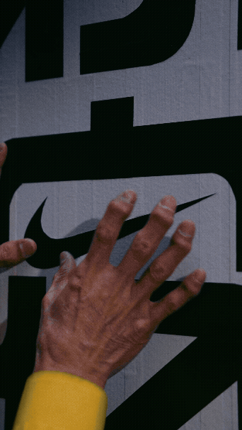
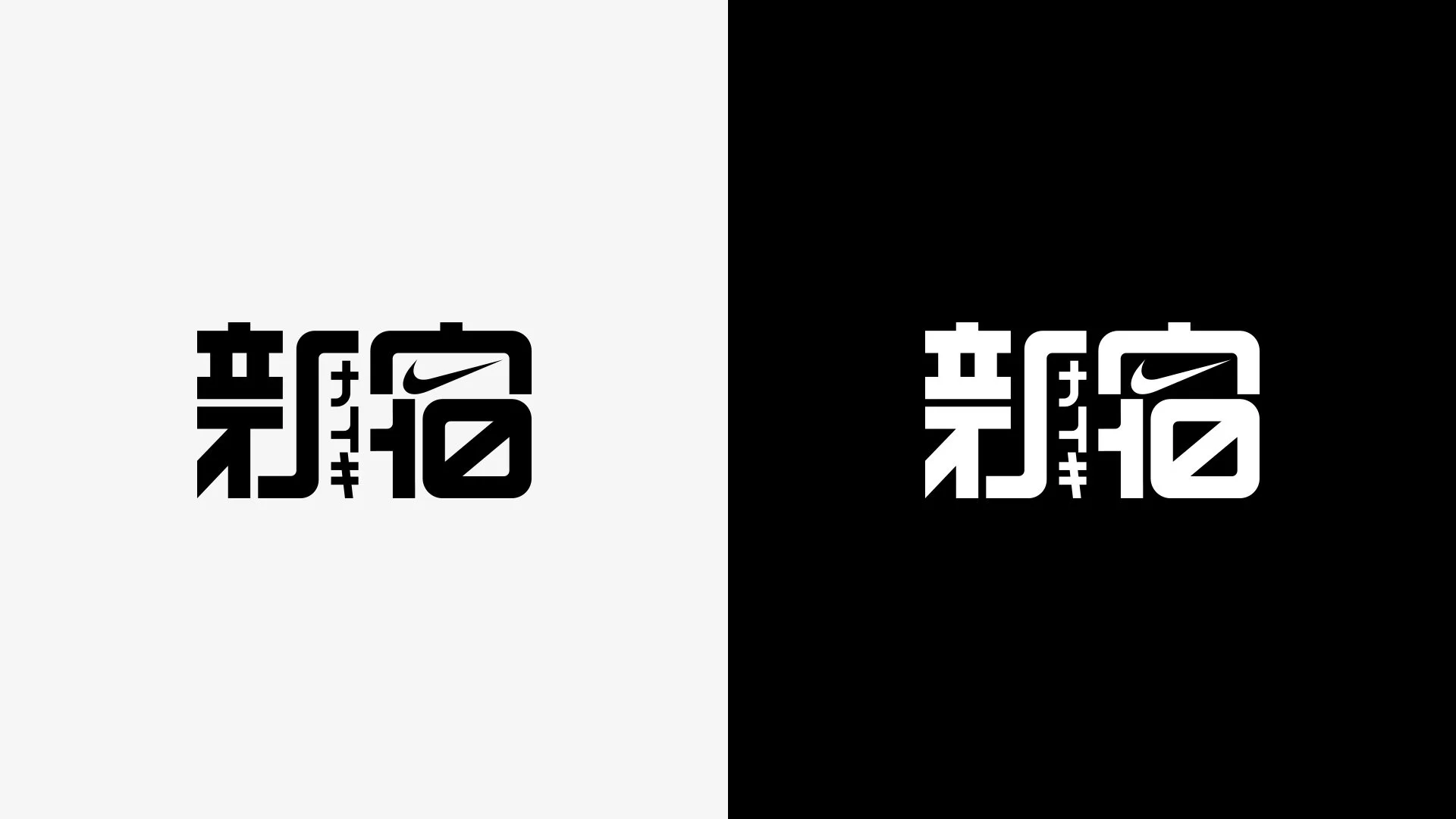
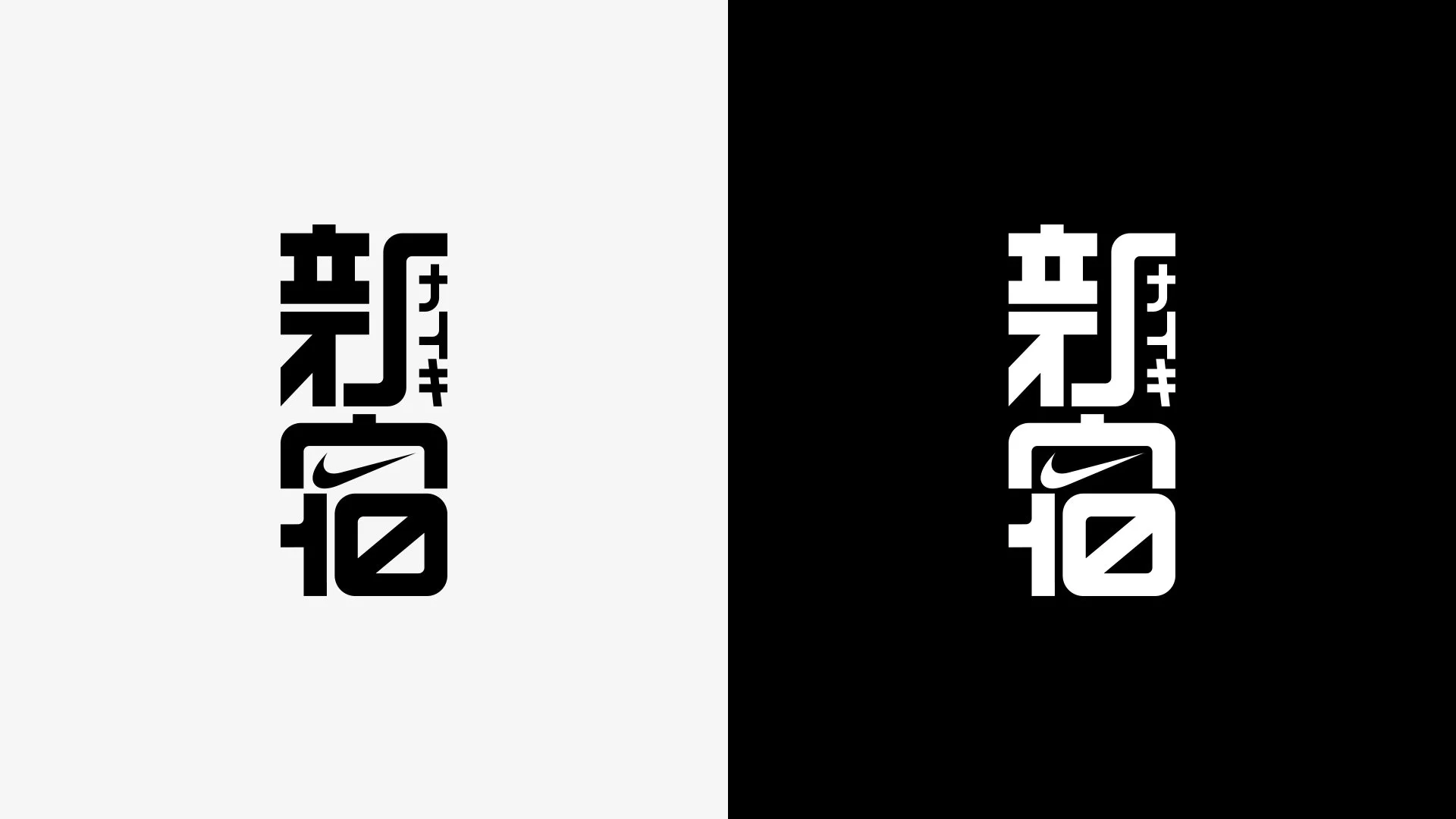
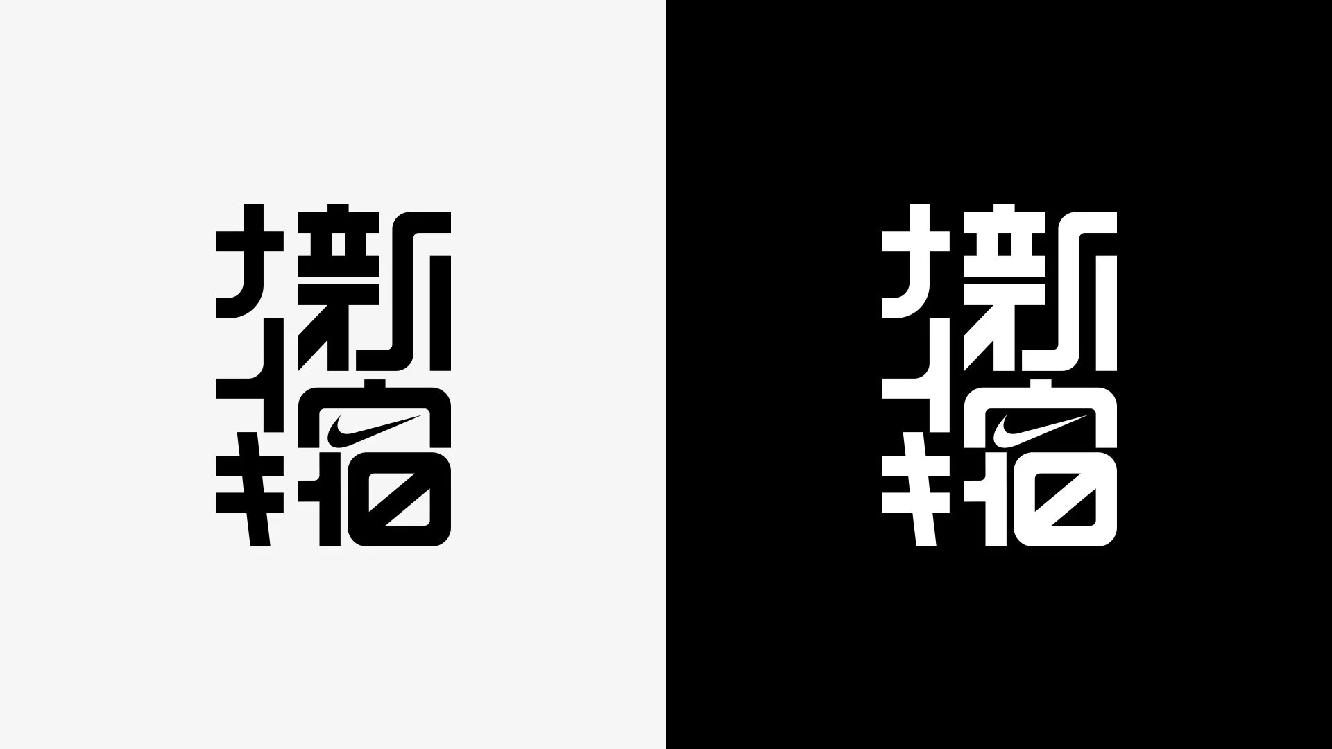
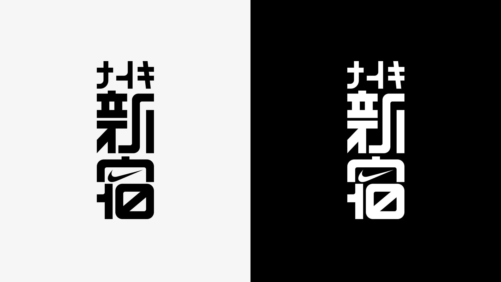
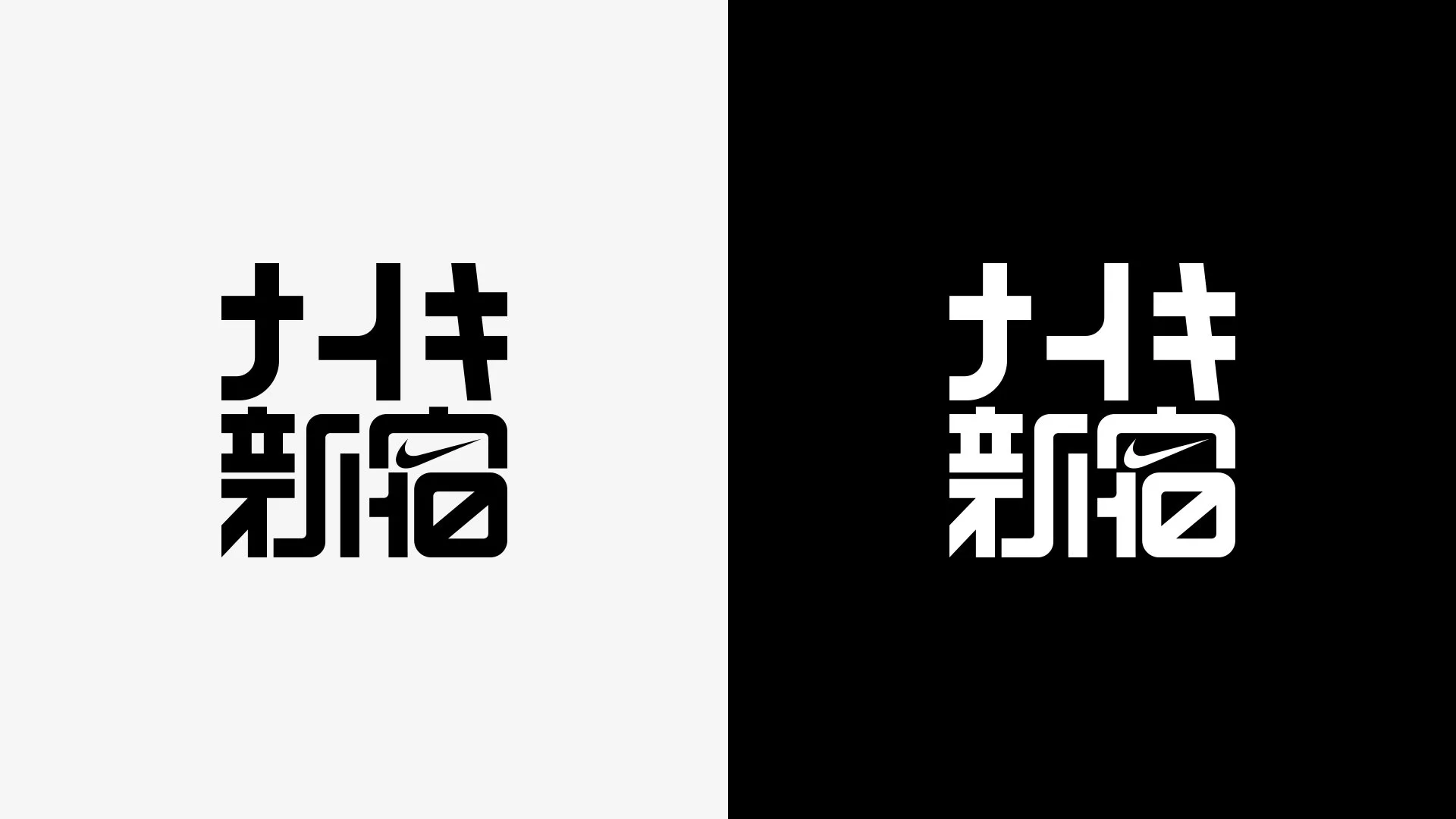
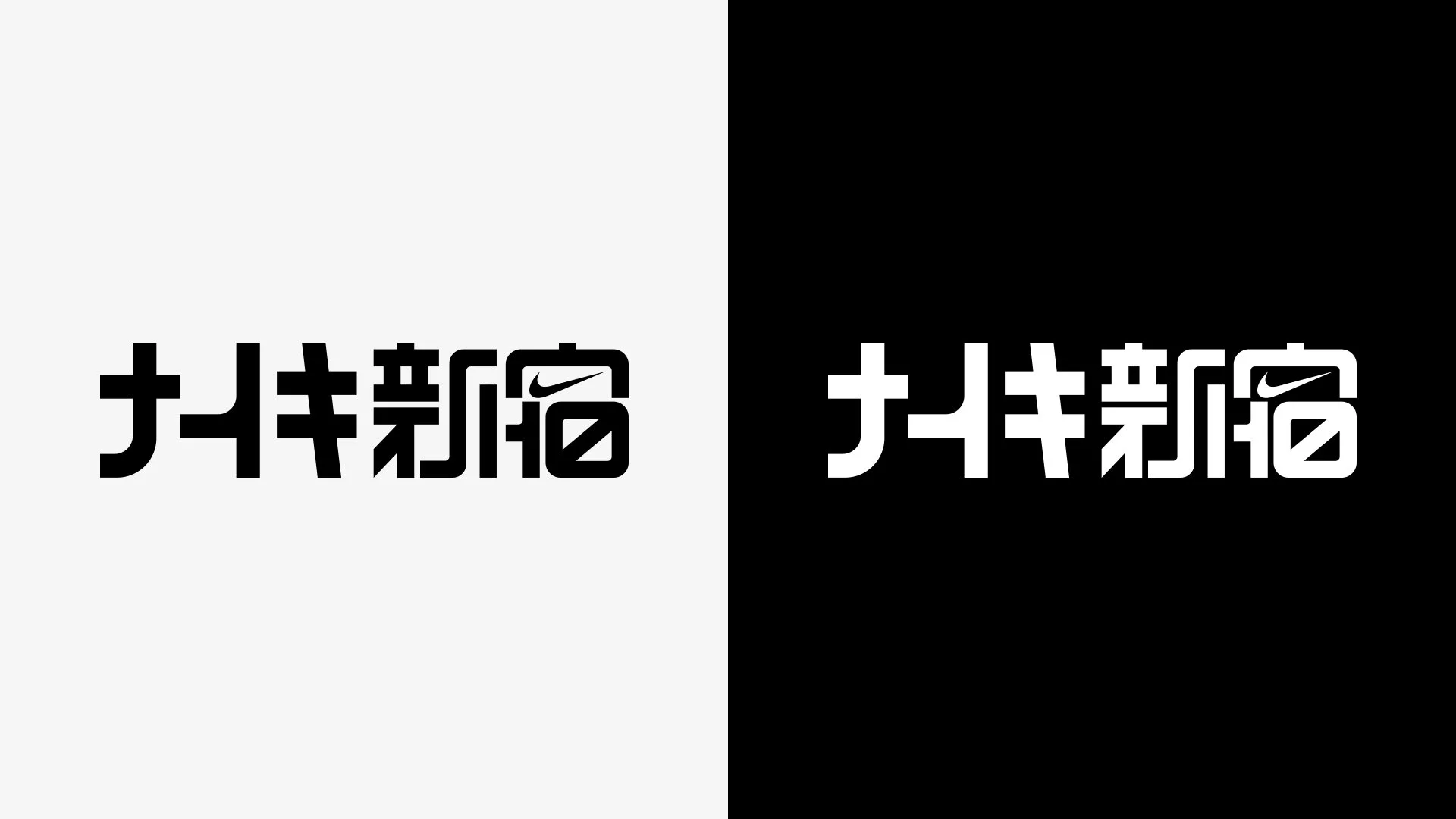
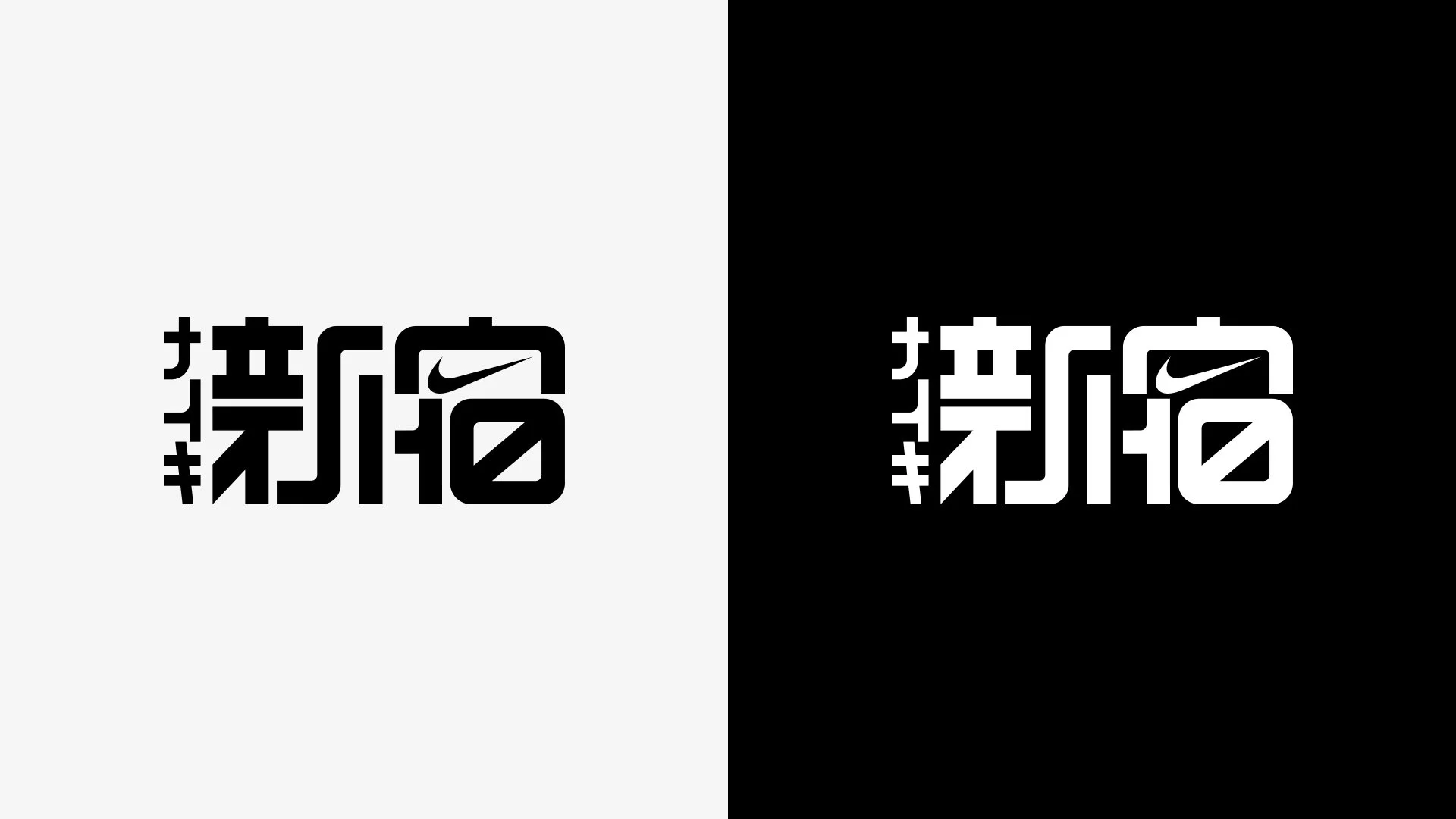
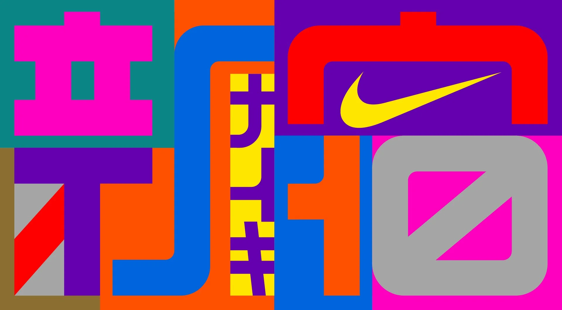
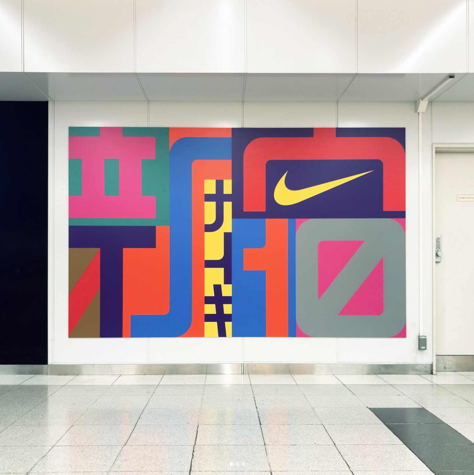
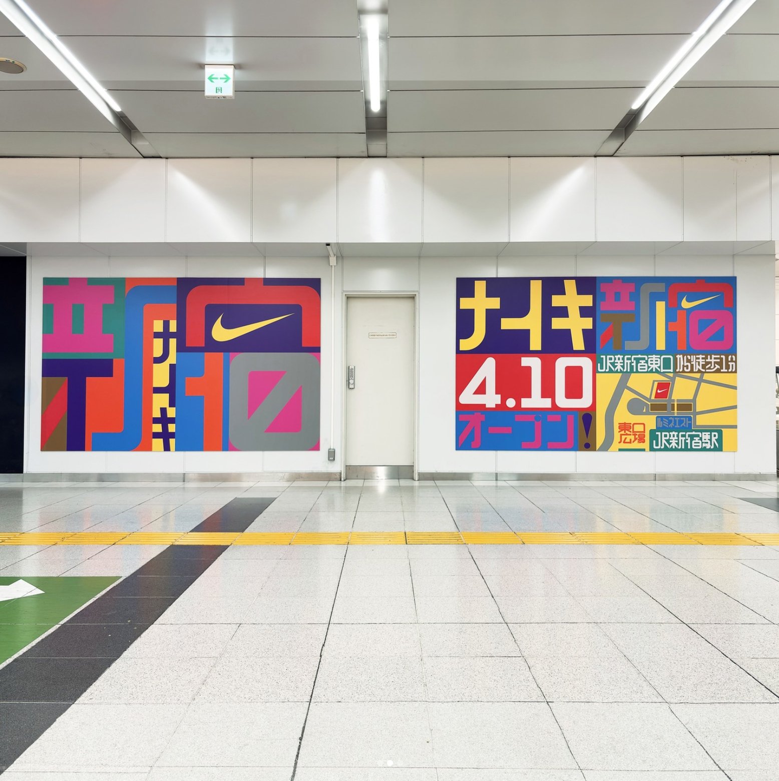
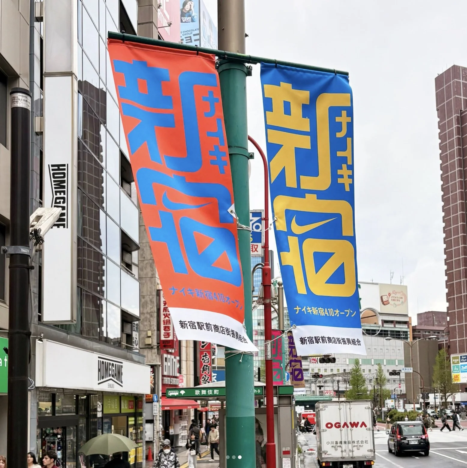
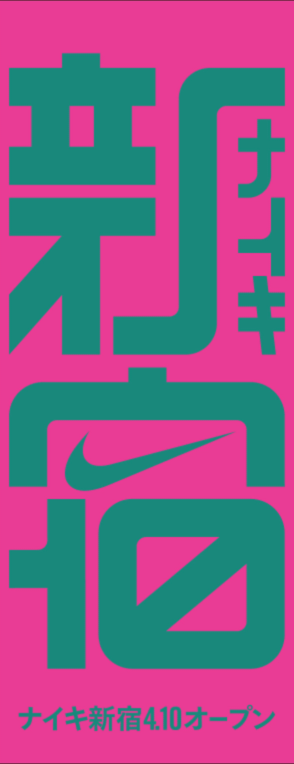
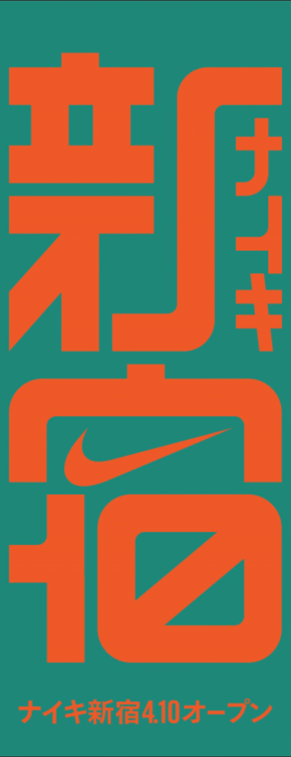
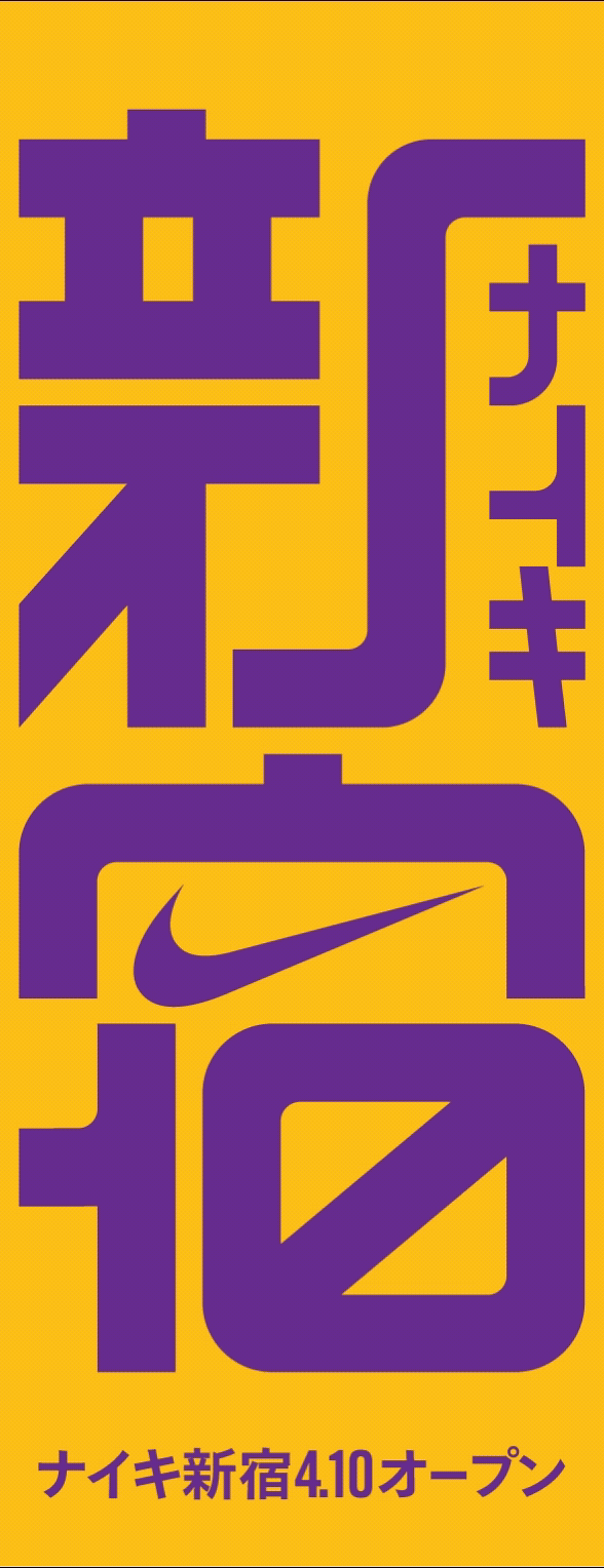
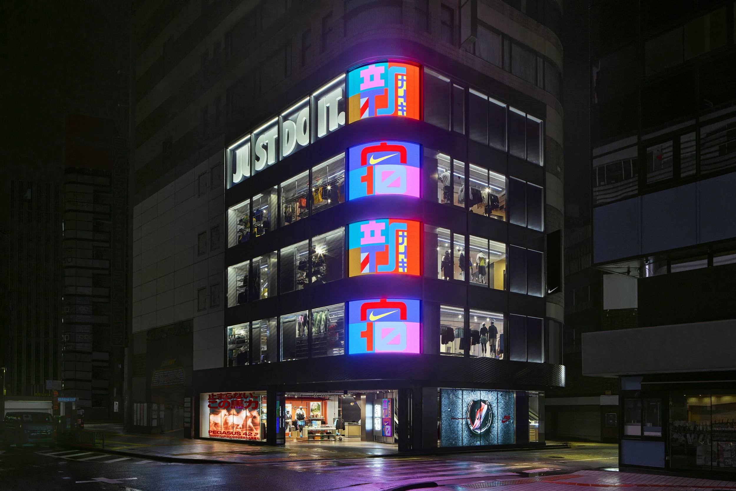
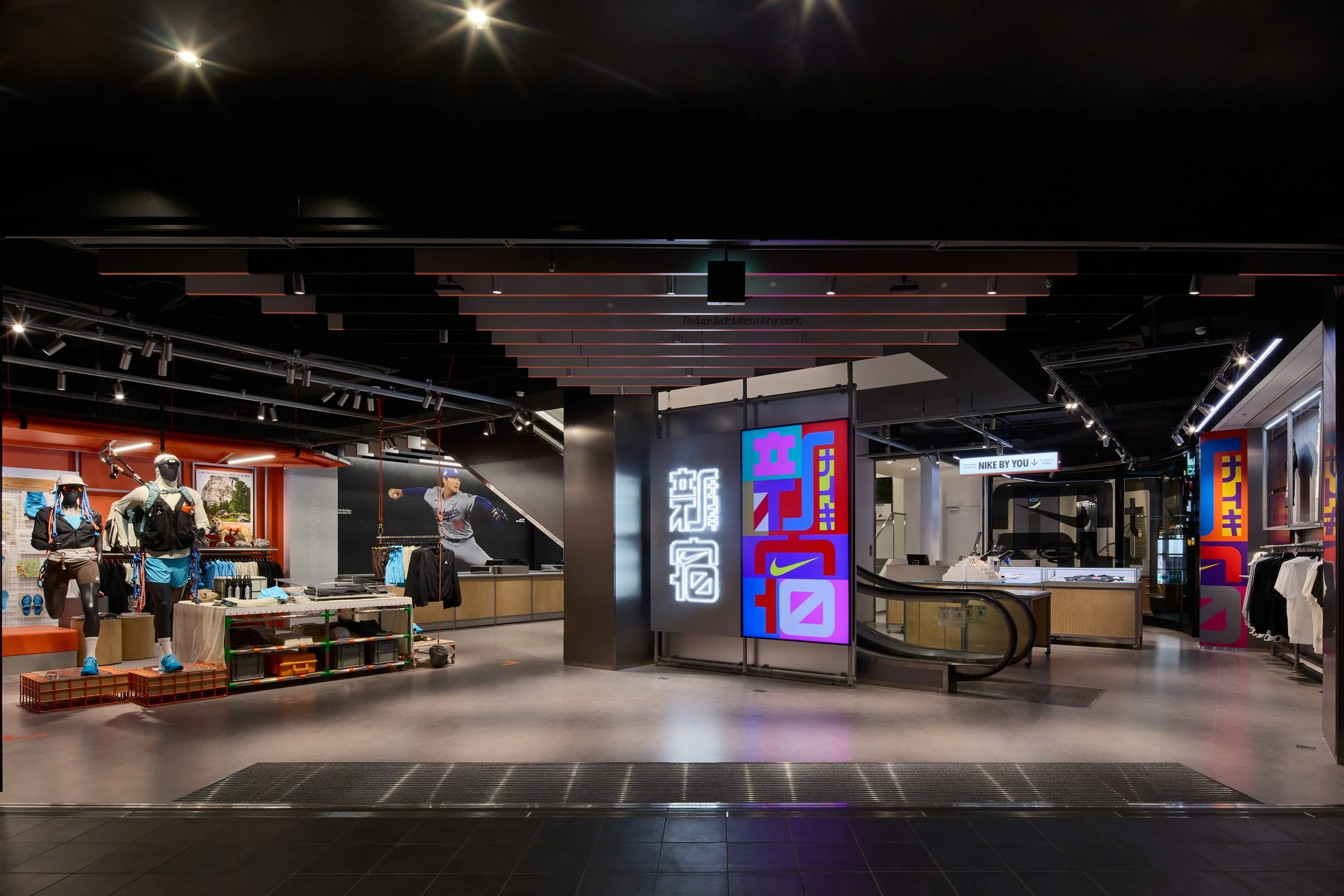
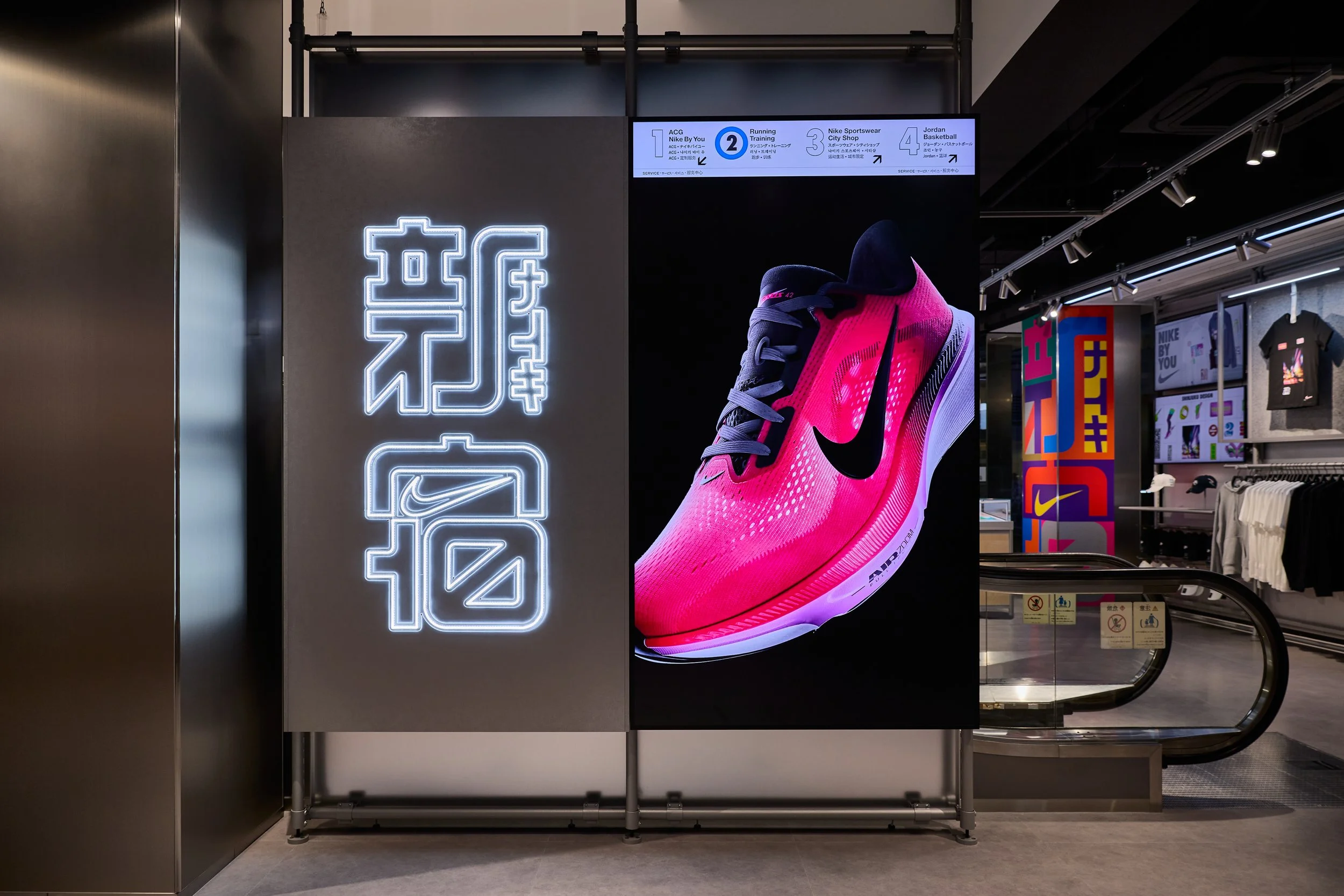
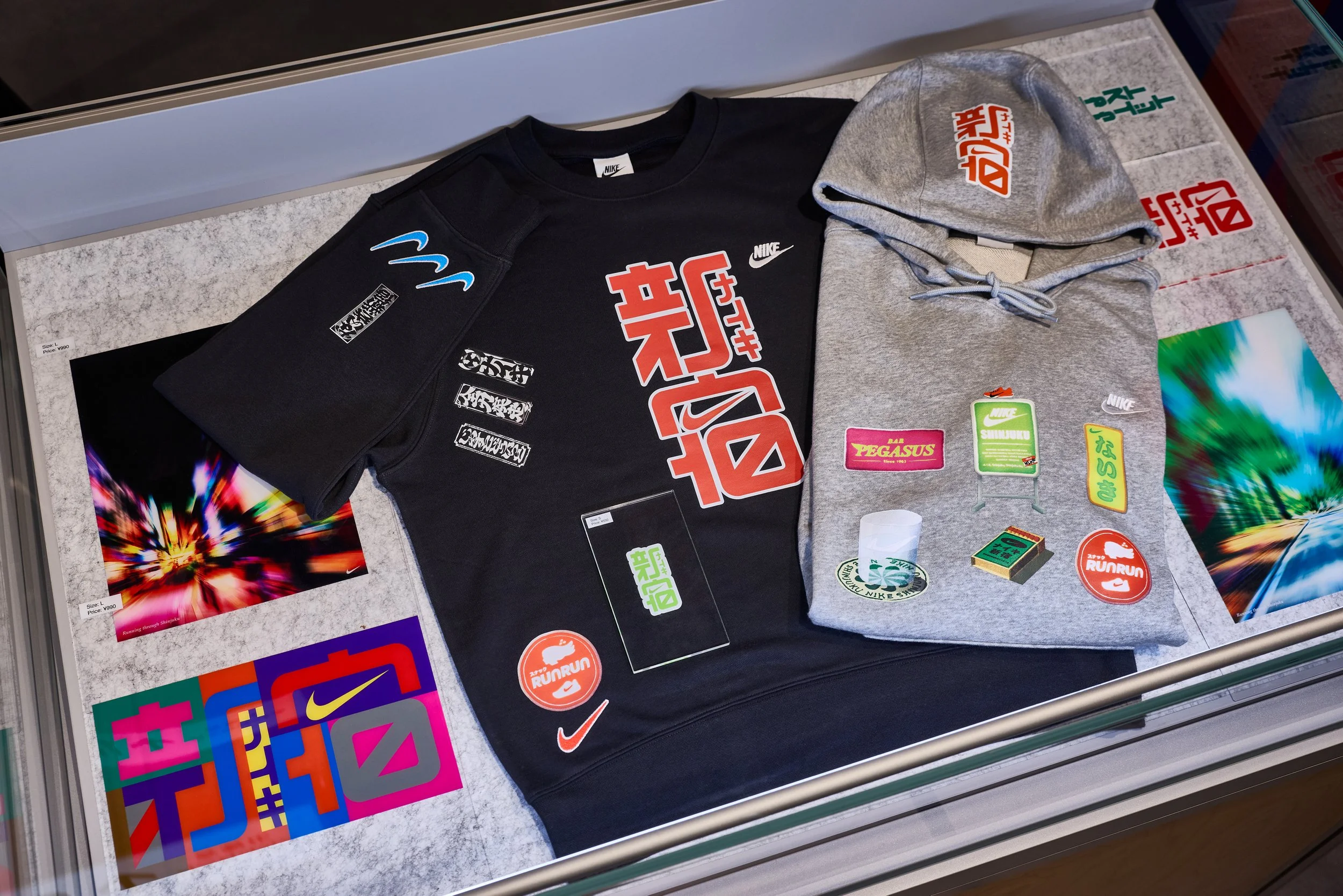
The strategy anchored in Kabuku, the spirit of bold and unapologetic eccentricity. I led the collaboration with Sato-san, commissioning him to design the logo in his signature medium: duct tape, hand crafted on the floor of the station he has protected for decades. Every color in the palette was mapped to the specific JR and subway lines running through the hub. The aggressive, rhythmic lines of the tape mirrored both the physical tracks and the kinetic energy of an athlete. Working with art director Shun Sasaki, we refined these raw analogue forms into a clean digital system, carrying that Kabuku energy across large scale OOH takeovers and LED facades throughout the station.
The Result
We didn't build a logo that looked like Shinjuku. We built one with the person who knows it best. The most powerful brand stories aren't invented. They are already living in the infrastructure and in the people who keep the city moving. -
佐藤修悦氏は、長く新宿駅で働きながら、20年以上にわたりガムテープを使った案内表示を作り続けてきました。毎日多くの人がその表示に導かれながら、ほとんど意識することはなかった。けれどそれは、新宿駅の中で生まれた、機能するアートでした。このプロジェクトは、その存在に改めて光を当てる機会になりました。
The Challenge(課題)1日400万人が行き交う新宿。Nikeのフラッグシップをこの街に構えるということは、膨大な情報が行き交う環境の中で、ブランドの存在感を埋もれさせないことを意味しました。必要だったのは、外から持ち込まれたデザインではなく、この街の質感や動きから自然に生まれたアイデンティティでした。
The Solution(解決策)戦略の核に据えたのは、大胆で型破りな精神を持つ「歌舞く」という考え方。私は佐藤氏とのコラボレーションを主導し、彼のシグネチャーであるガムテープを使ったロゴ制作を依頼しました。制作の舞台は、彼が長年働いてきた新宿駅そのもの。カラーパレットは、新宿に乗り入れるJR・地下鉄各線の色を反映しています。
ガムテープ特有の鋭くリズミカルな線は、駅の線路のようにも、アスリートの動きのようにも見えるものでした。そのアナログな造形を、アートディレクターの佐々木俊氏とともにデジタルシステムへと整え、駅構内の大型OOHやLEDファサードへと展開しました。
The Result(結果)新宿らしいロゴを作ったのではありません。新宿を最もよく知る人とともに、新宿から生まれたロゴを作りました。
強いブランドストーリーは、美しいデザインや体験だけで生まれるものではない。すでに街の中にあり、そこを動かし続ける人々の中にあるものです。