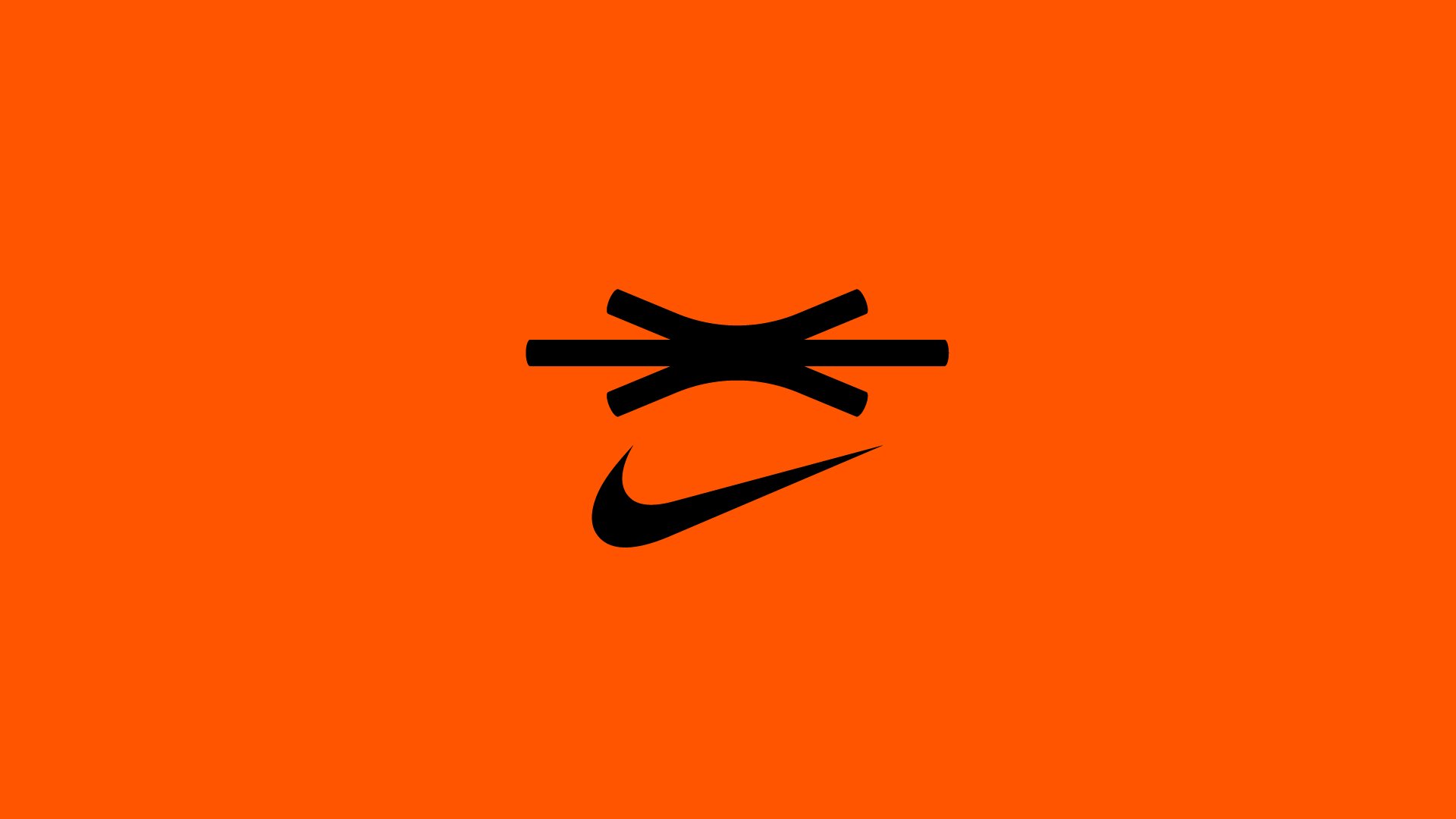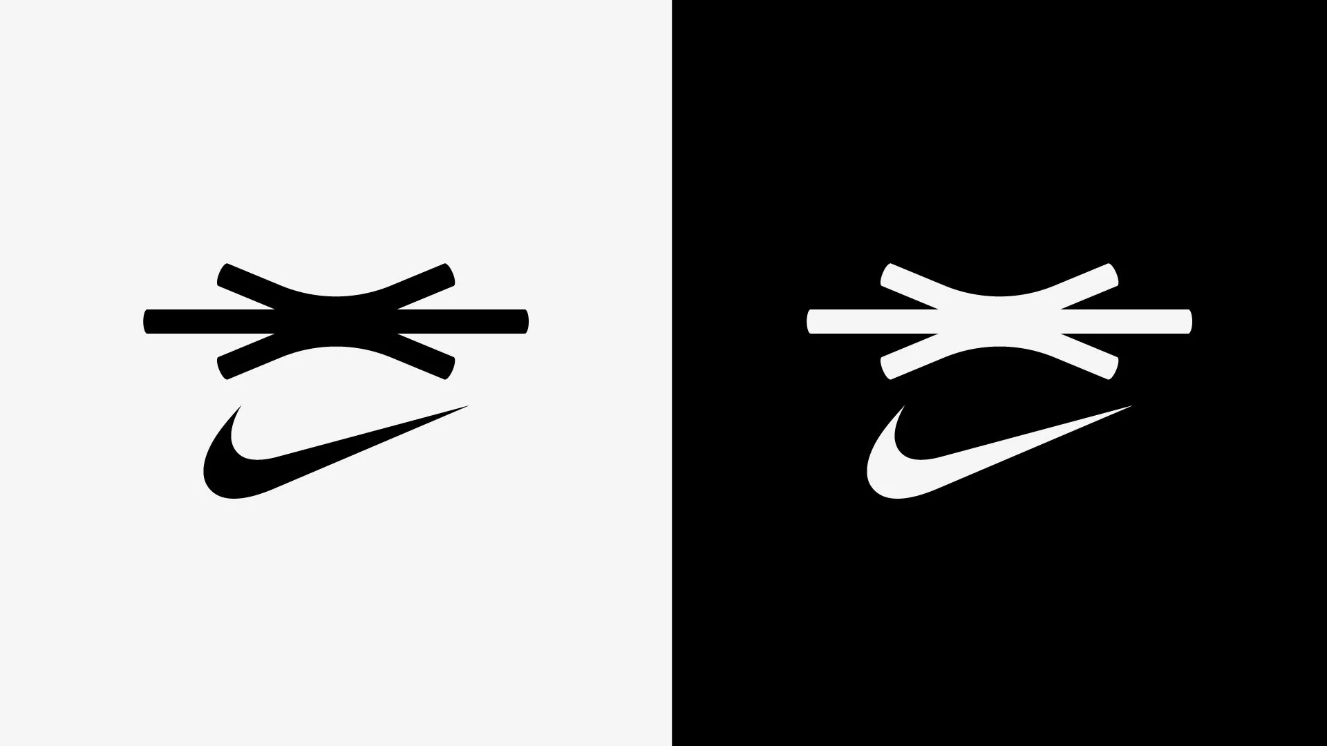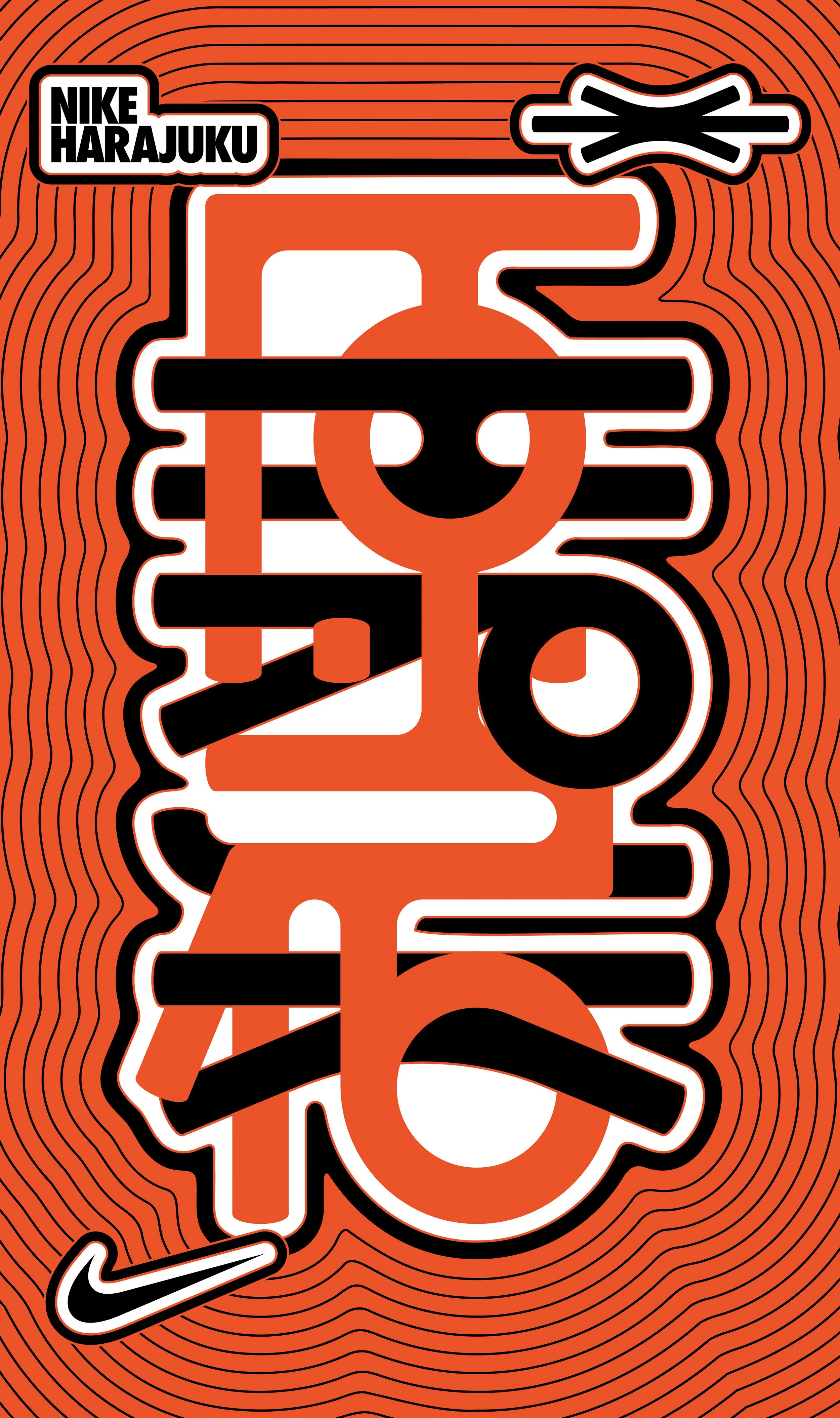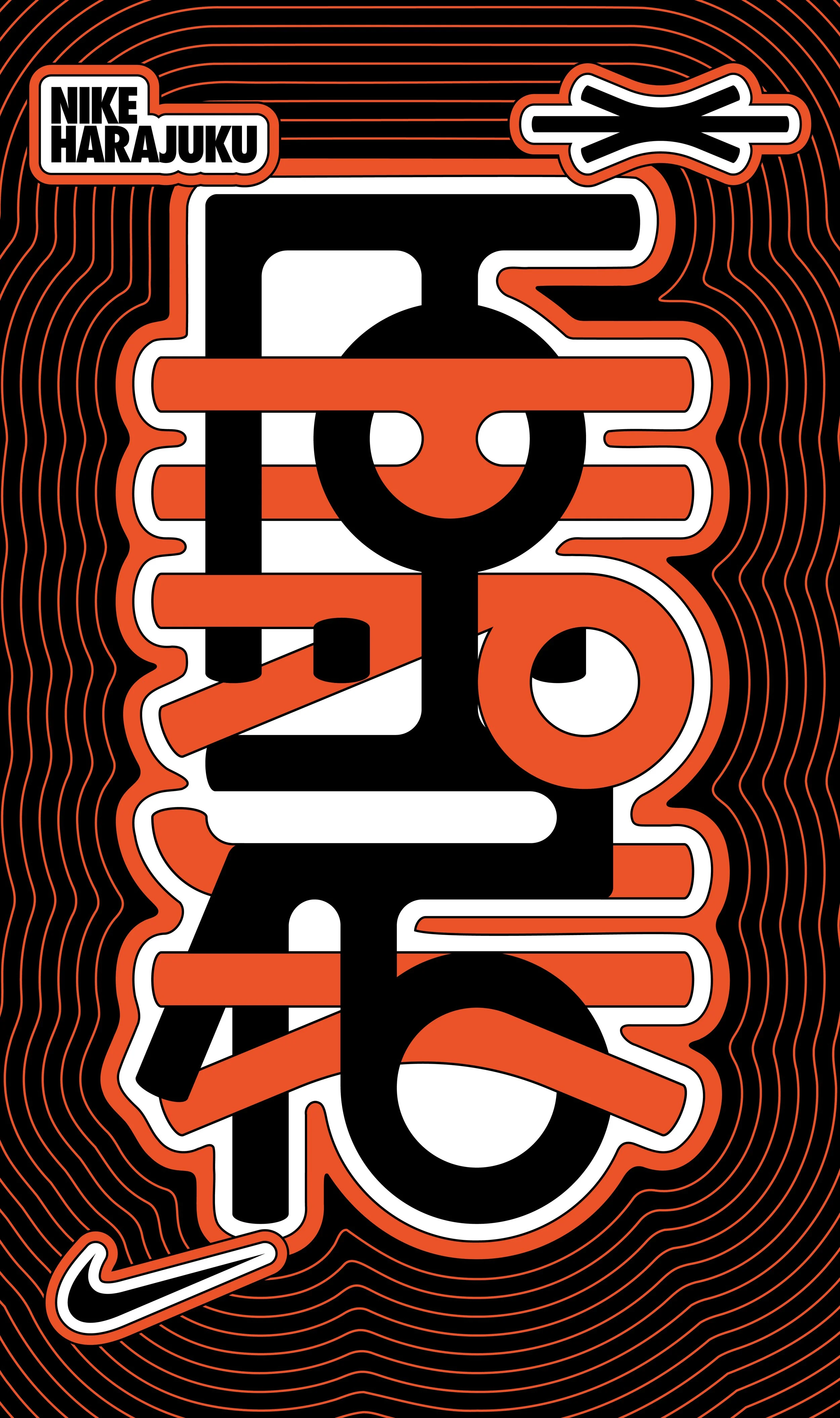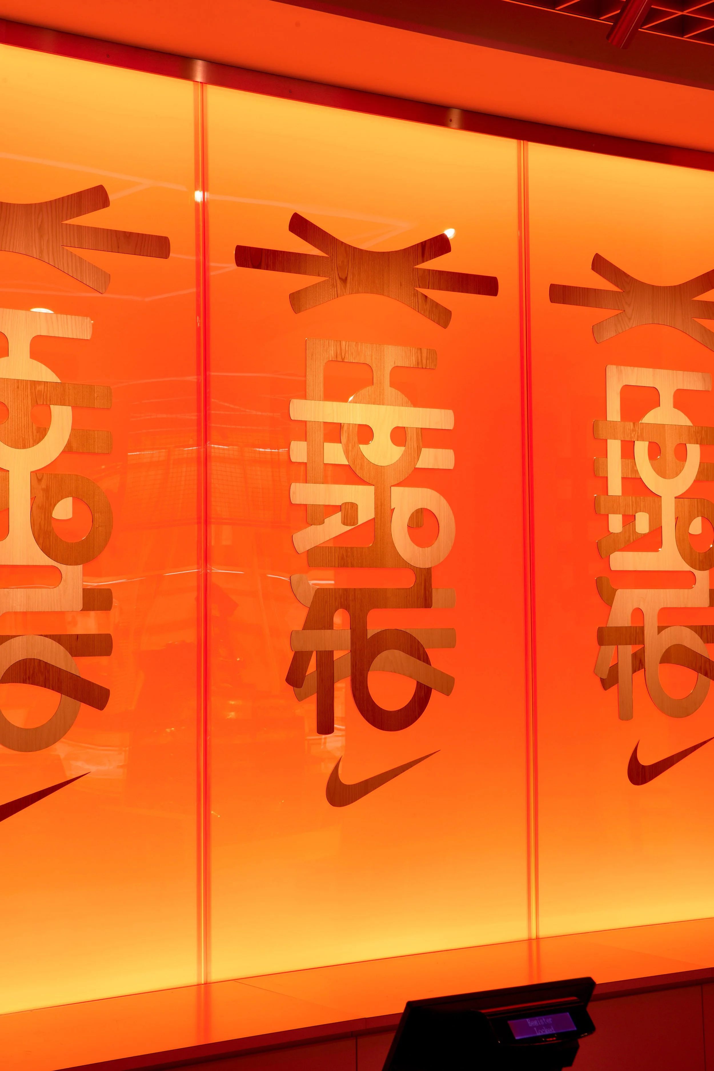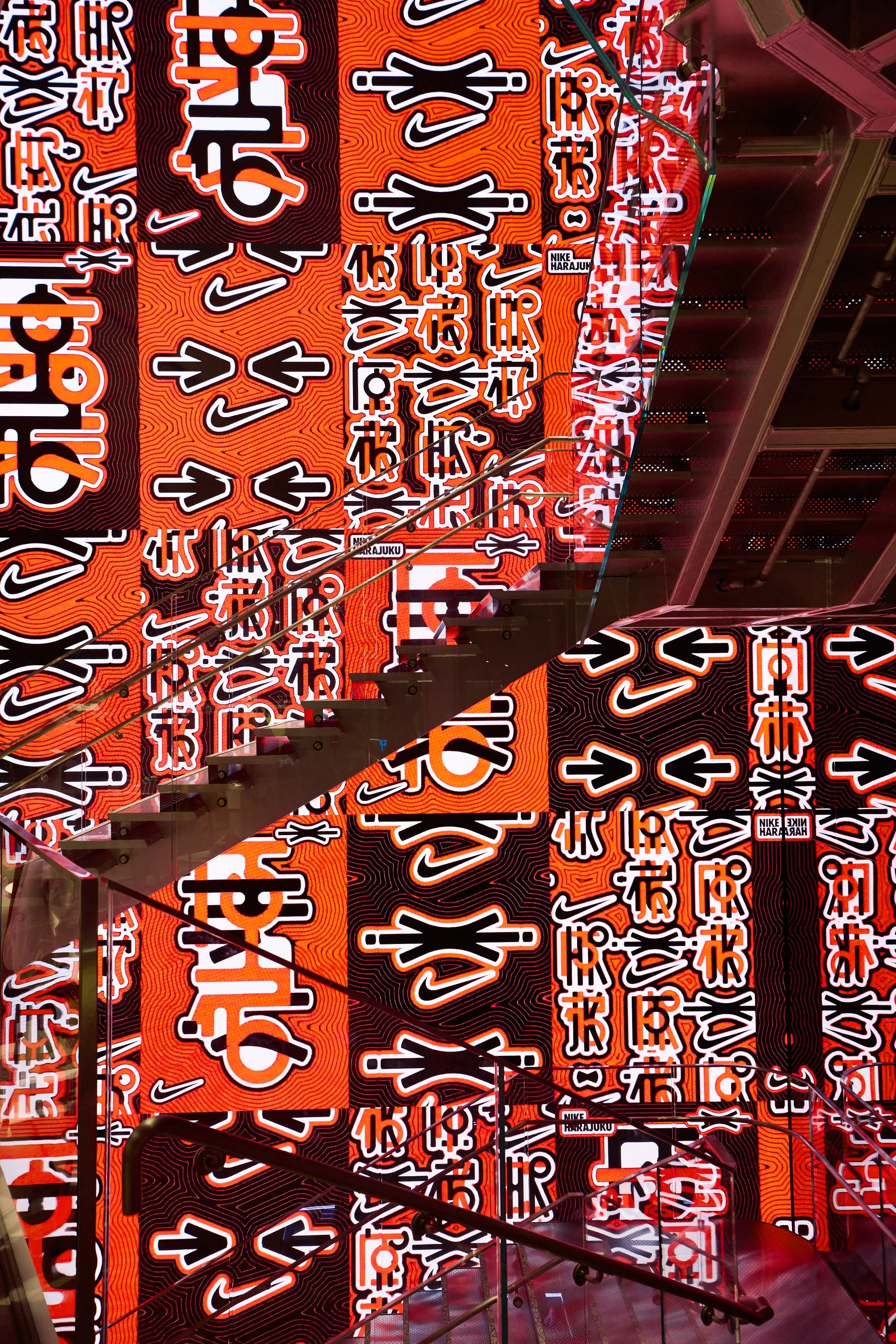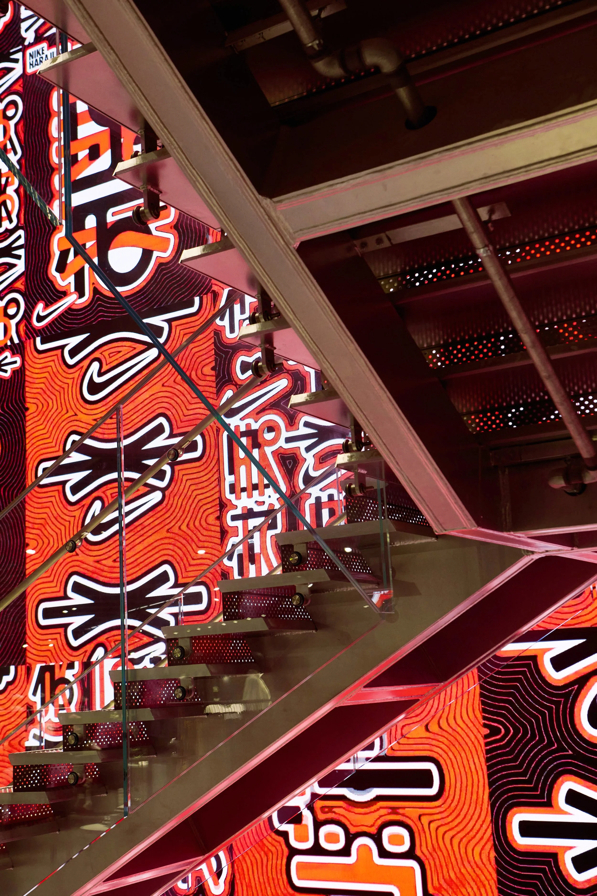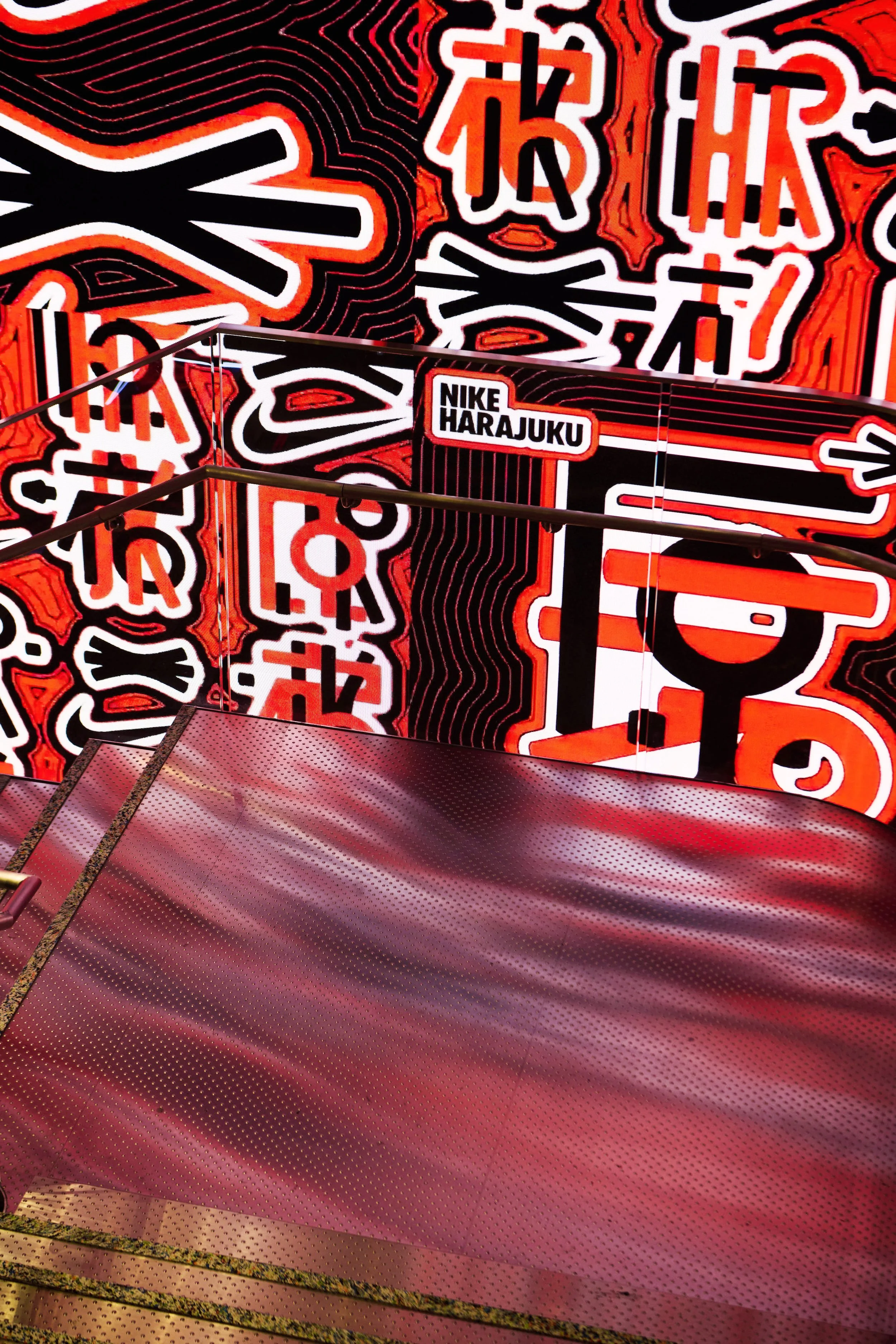
Nike Harajuku Identity
Where diverse cultures, values, and people collide through sport, creating movements never seen before. An identity system designed to capture the friction and energy of Harajuku.
Role: Creative Director / Design & Art Direction
-
To mark the store’s relocation, the brand needed to shed its corporate polish and reclaim the raw, chaotic energy of the neighborhood. The goal was an identity that didn't just label the building, but embodied the district itself.
-
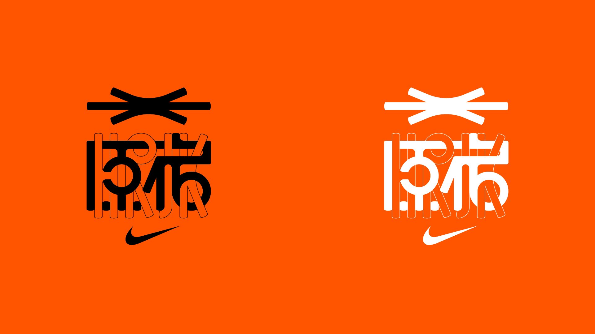
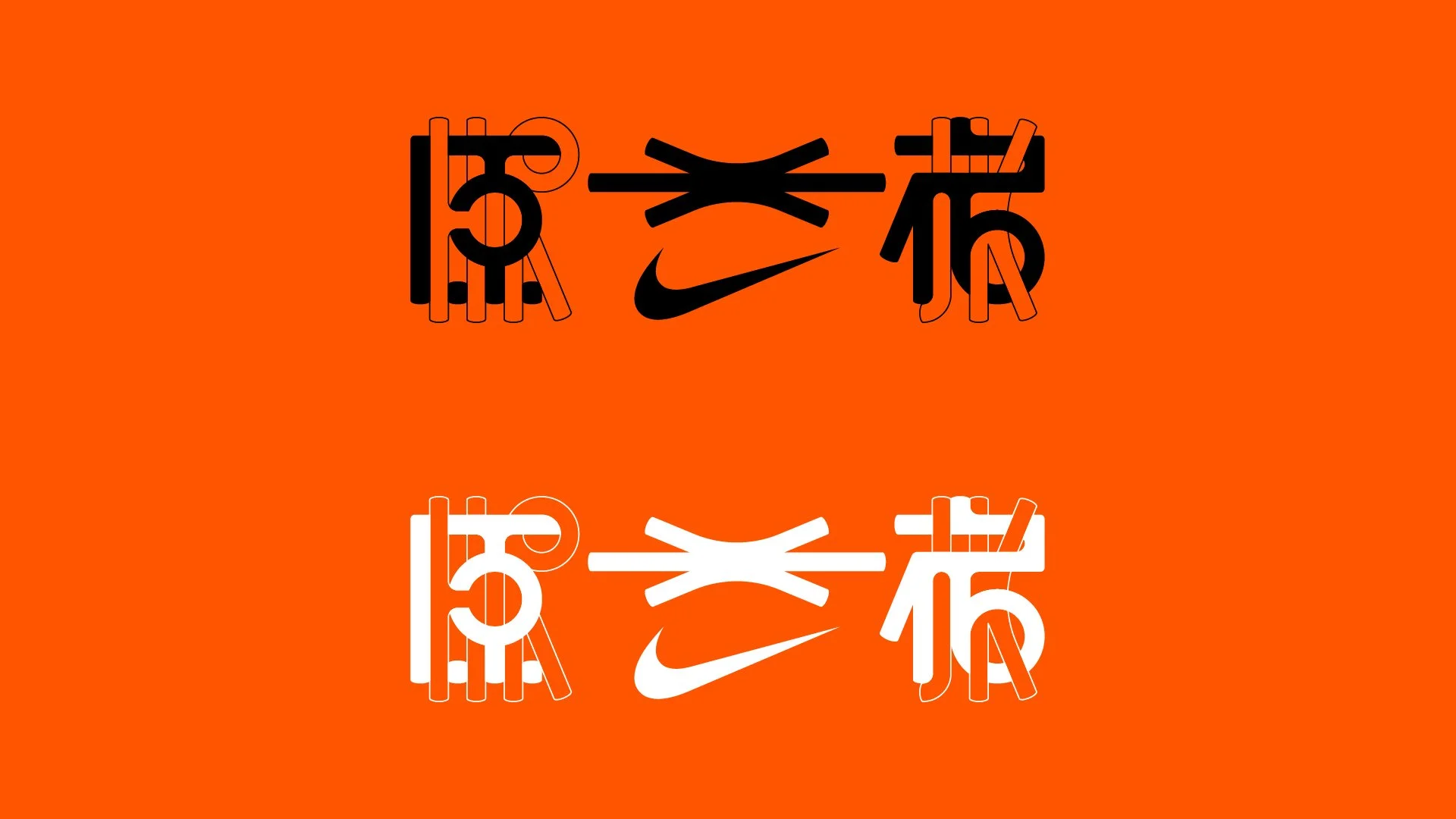
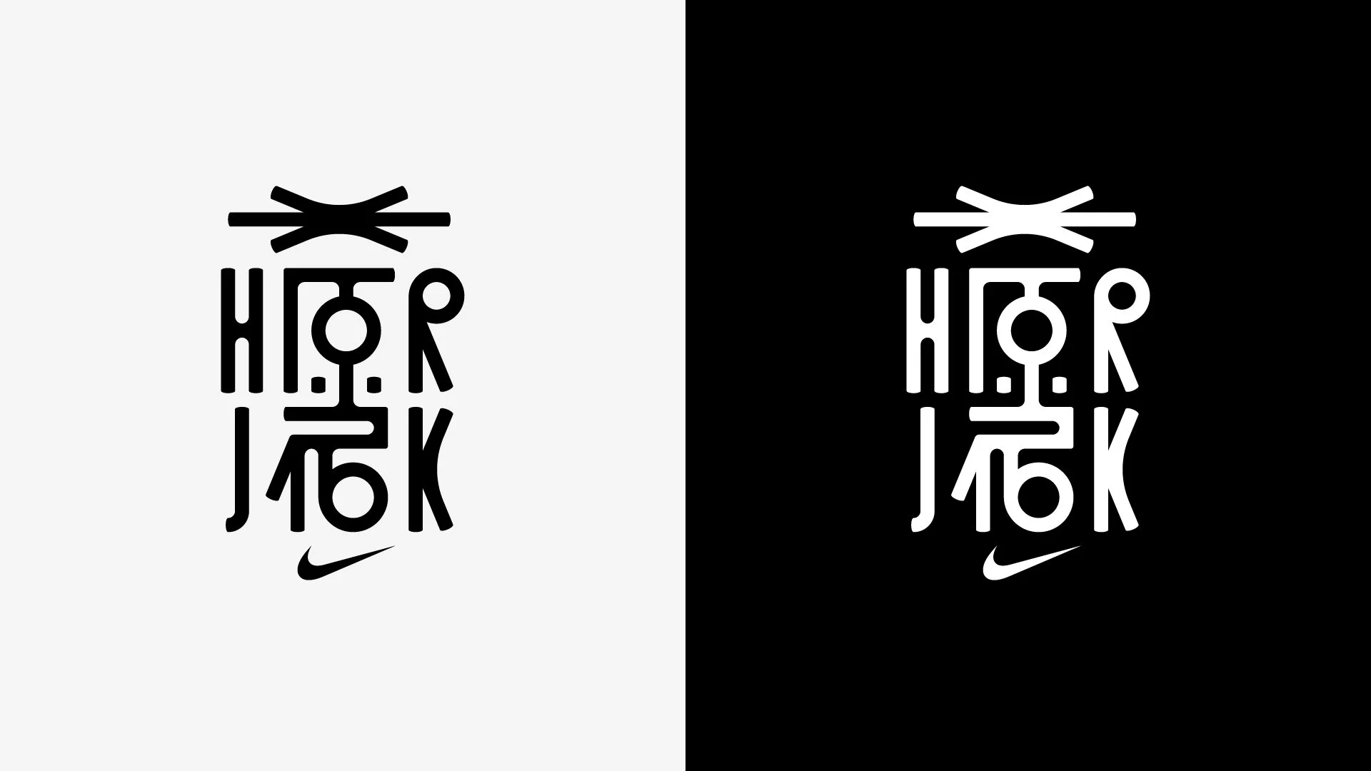
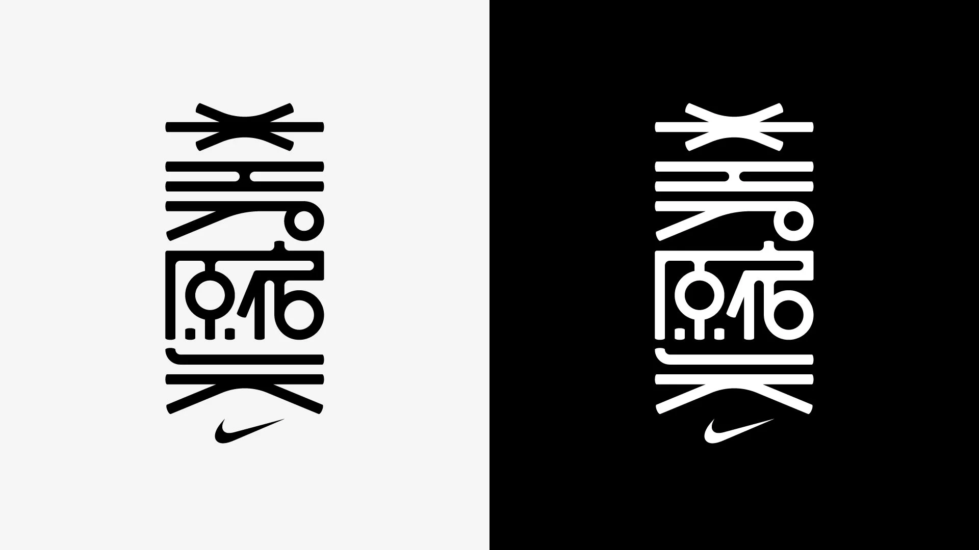
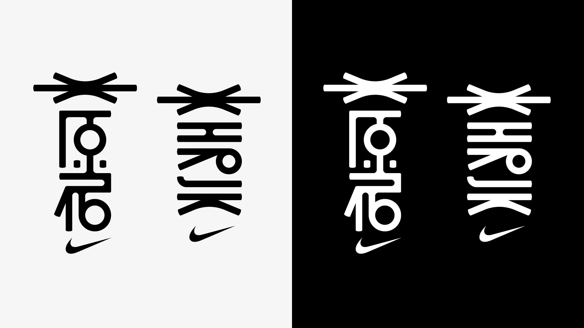
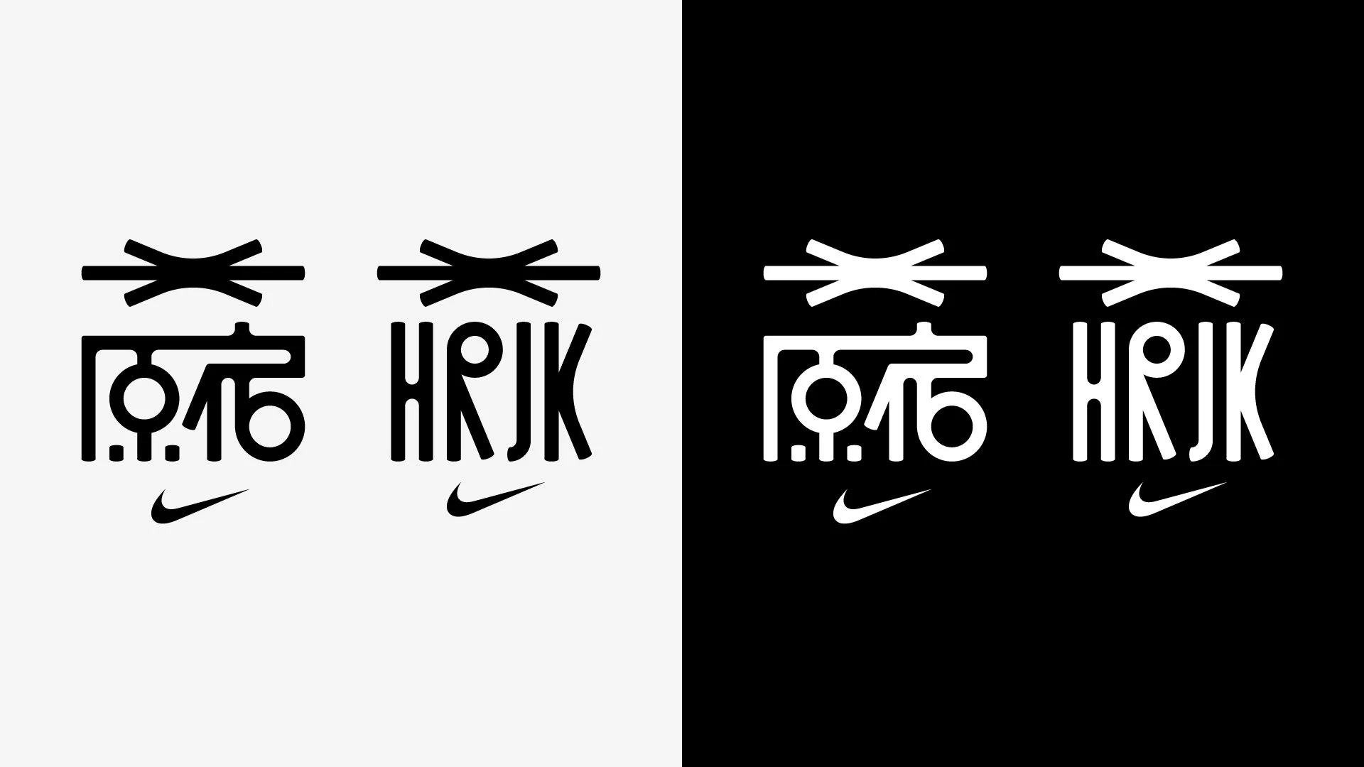
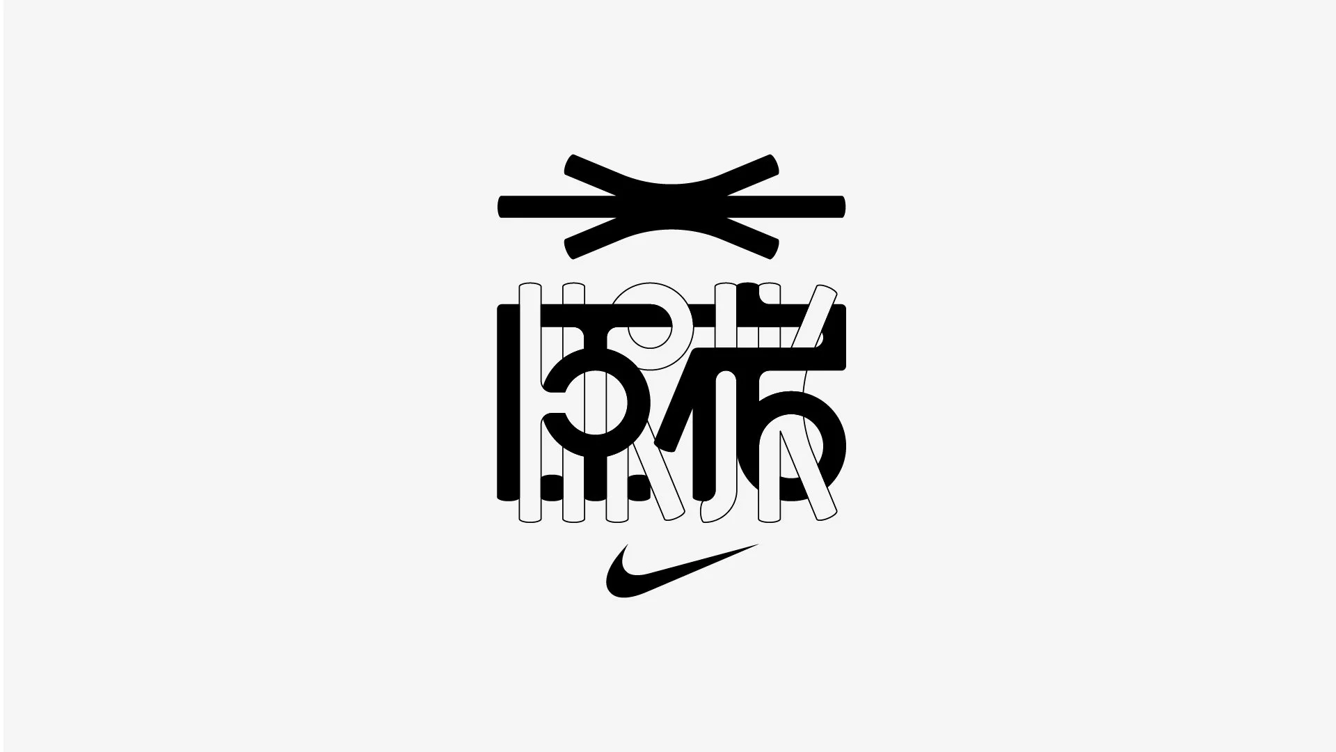
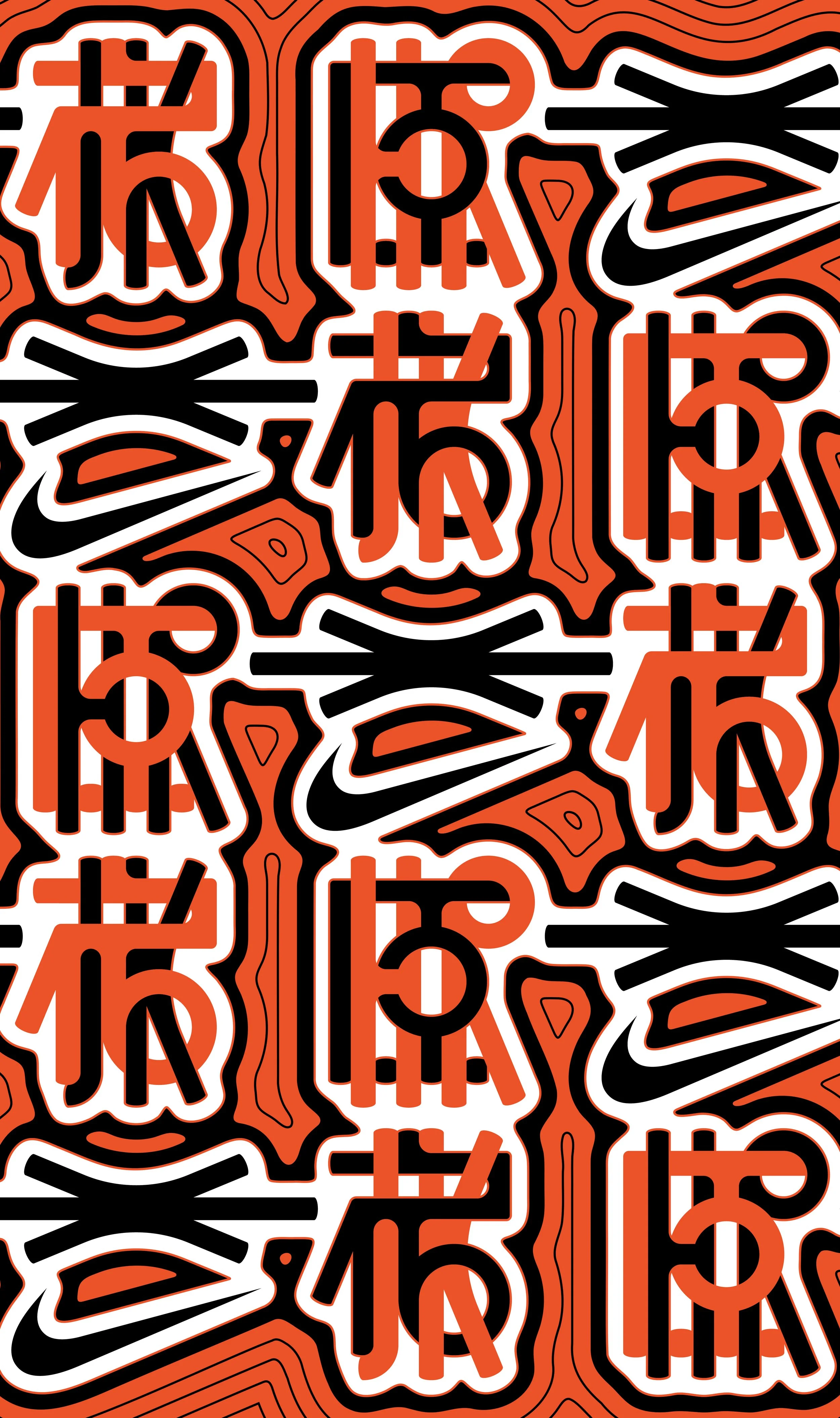
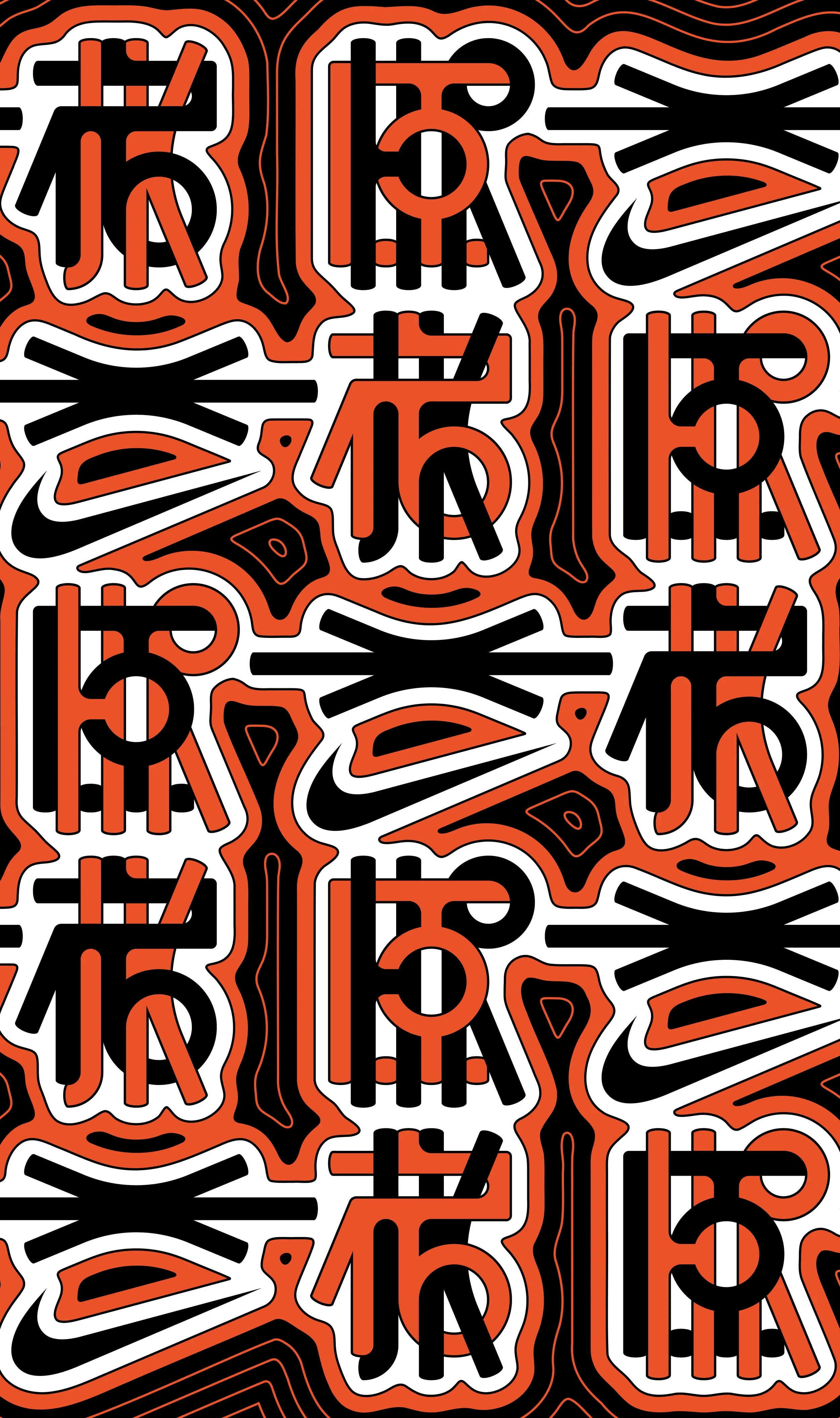
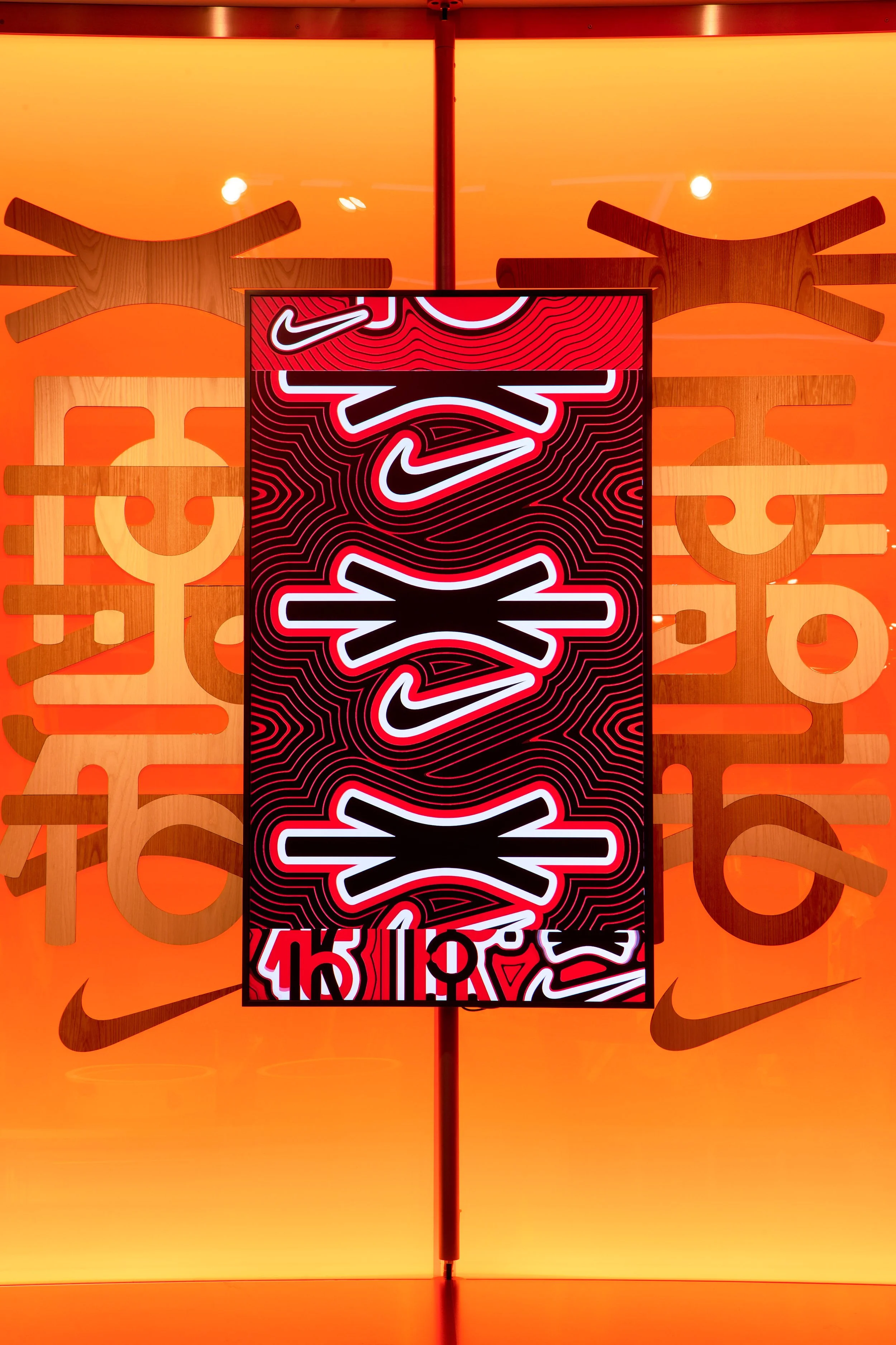
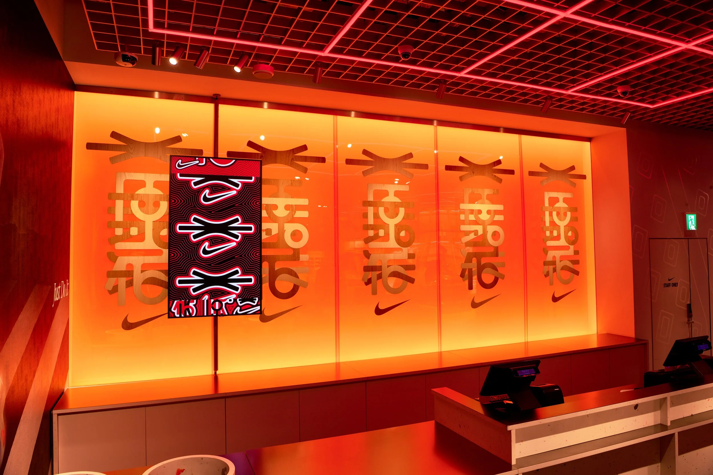
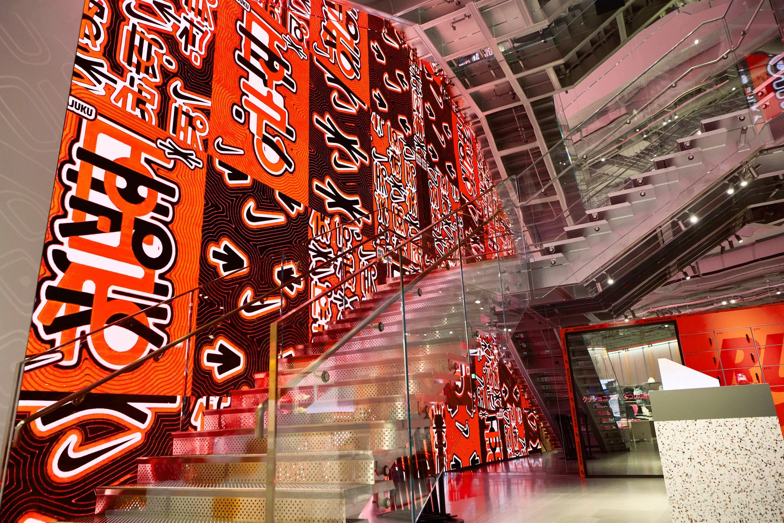
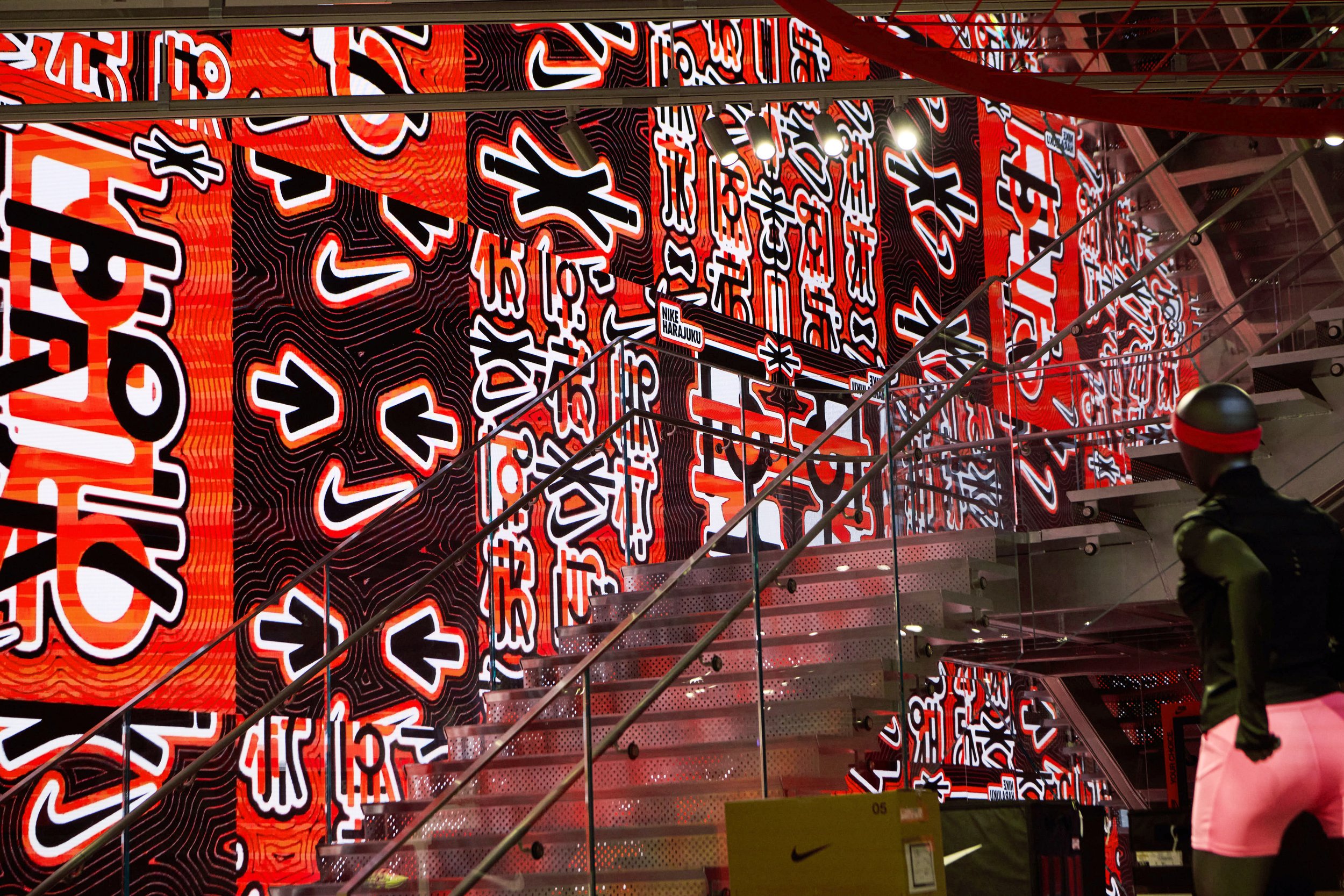
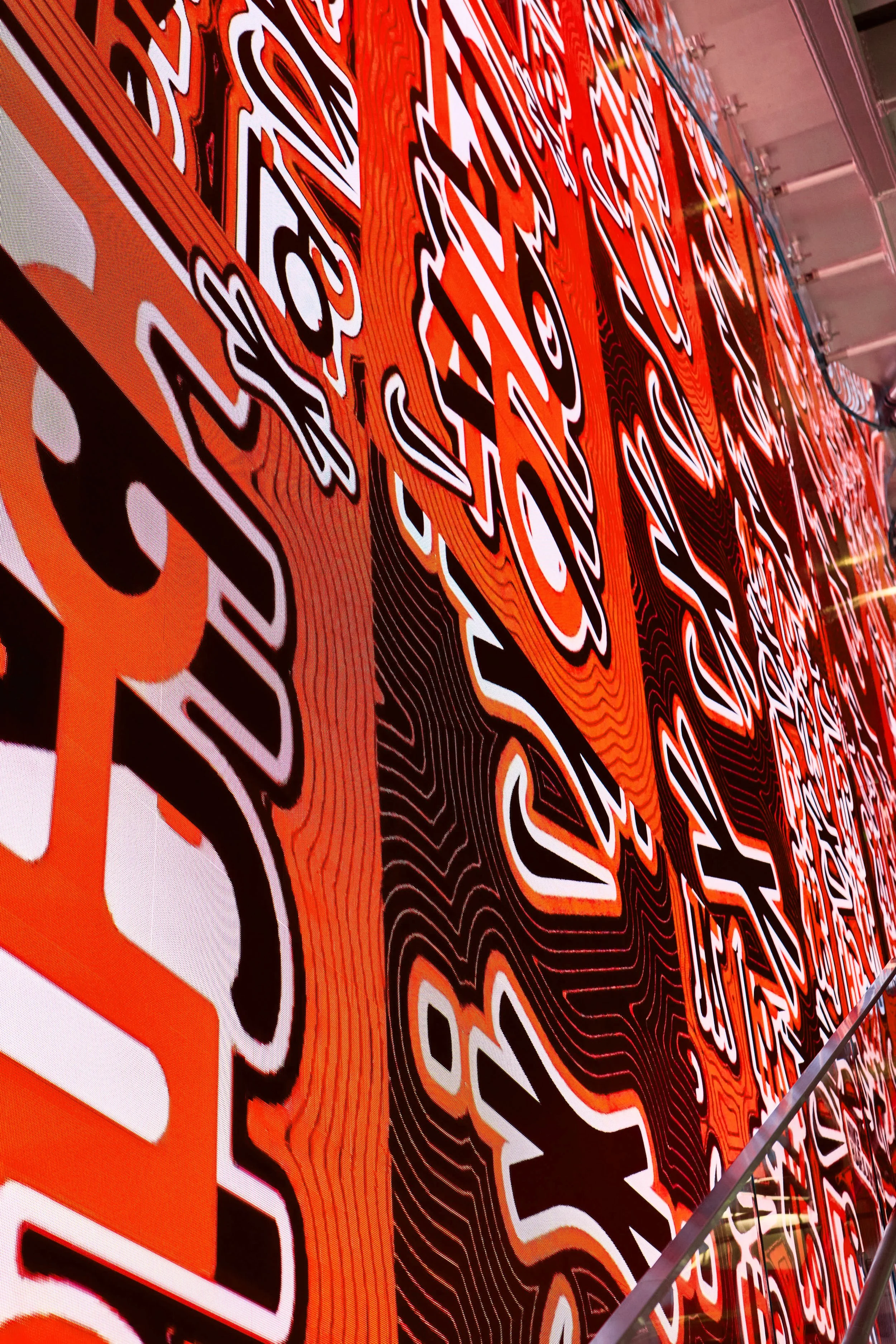
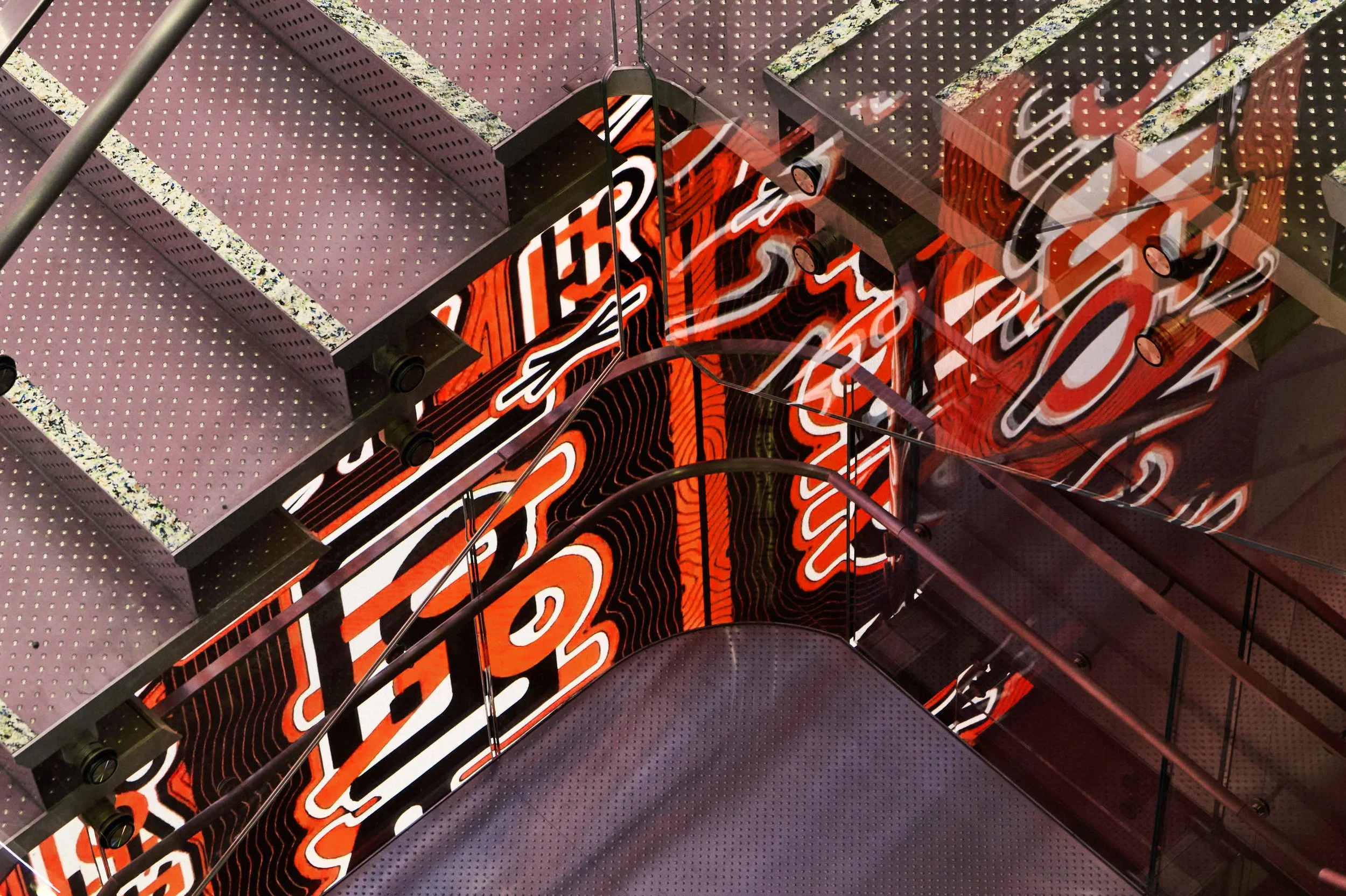
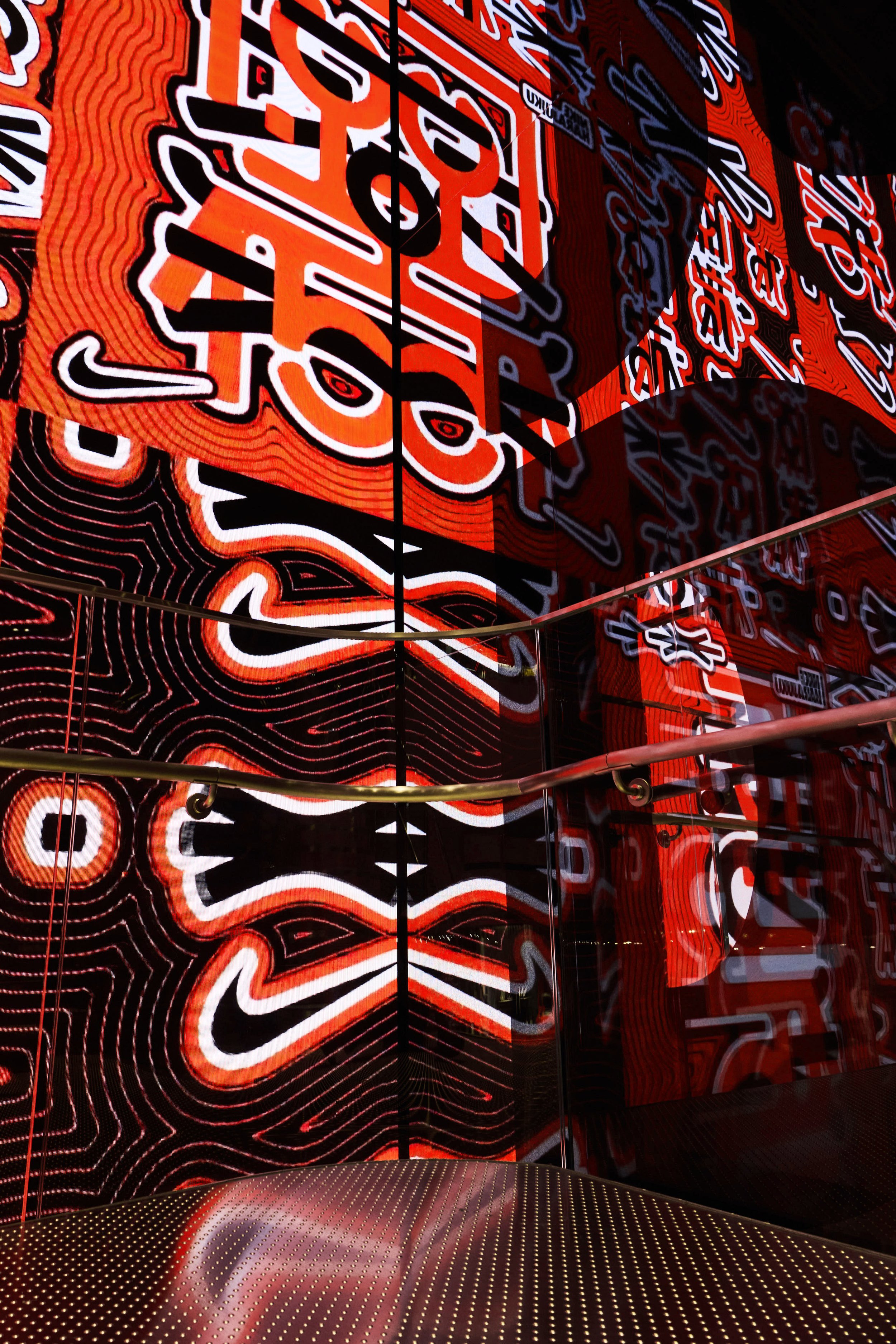
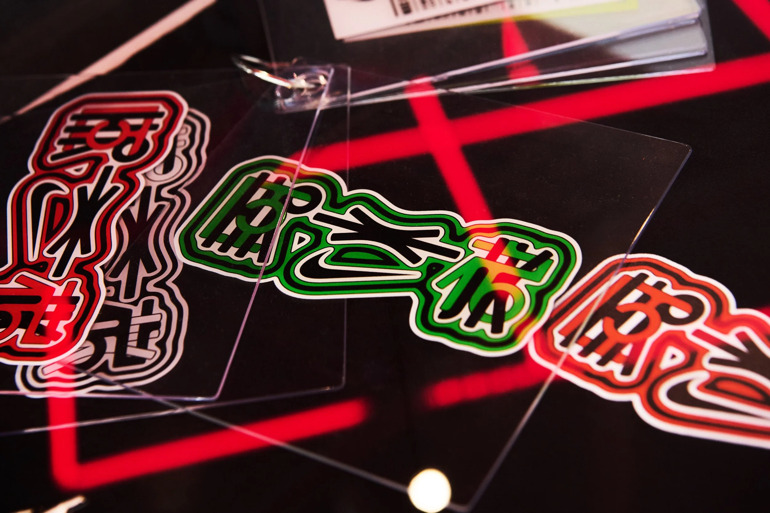
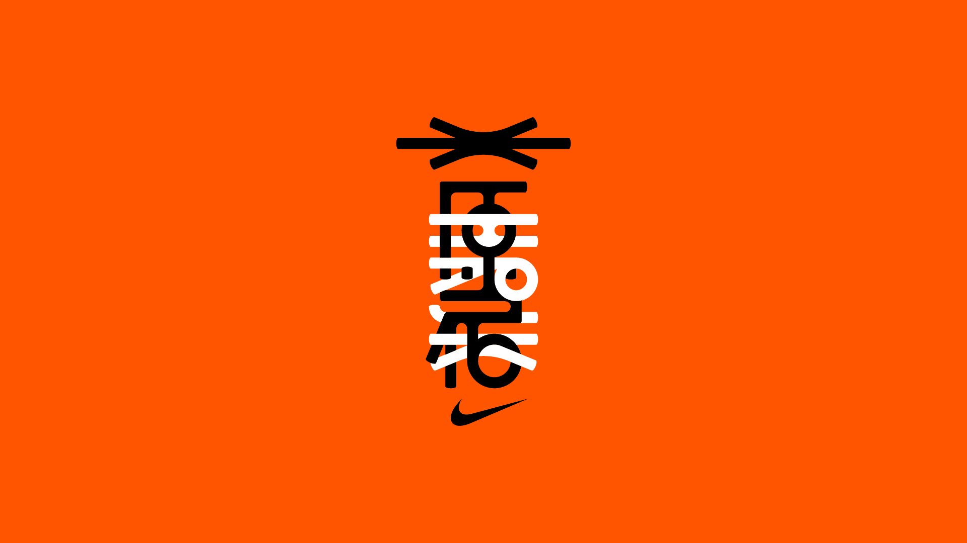
A typographic collision. We forced the global "NIKE" and local "原宿" (Harajuku) to occupy the same physical space. By utilizing negative space to resolve the legibility, the two scripts become a single, unified totem—visualizing the clash of cultures that defines the city.